Bespoke fonts tailored to your brand
A typeface drawn for you gives your identity a voice no one else has. Every letter, number and symbol is designed around your brand and optimised for where it lives: screens, print, logos, signage. You decide the style, proportions, weight and the finer details.
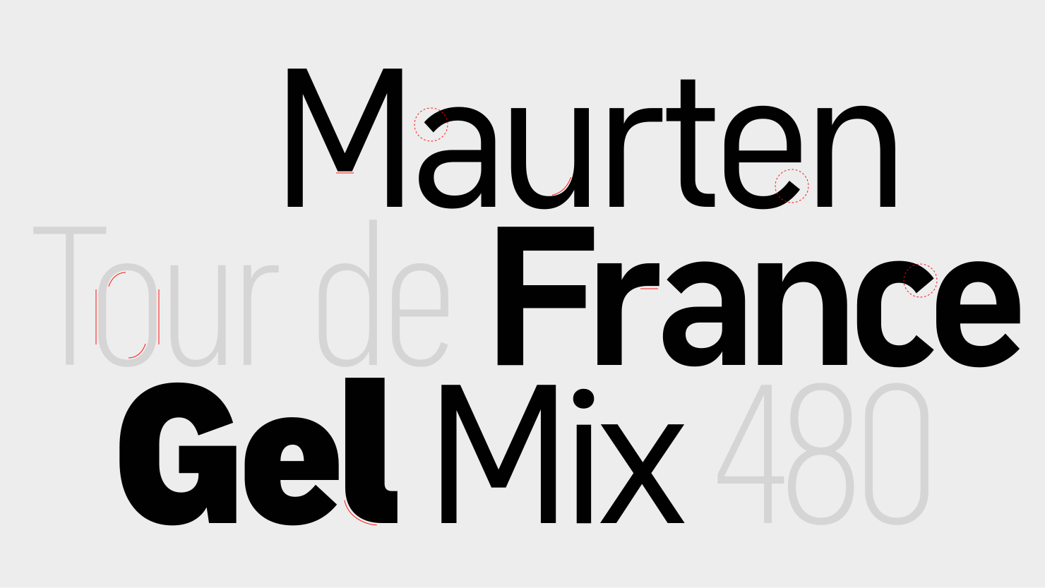
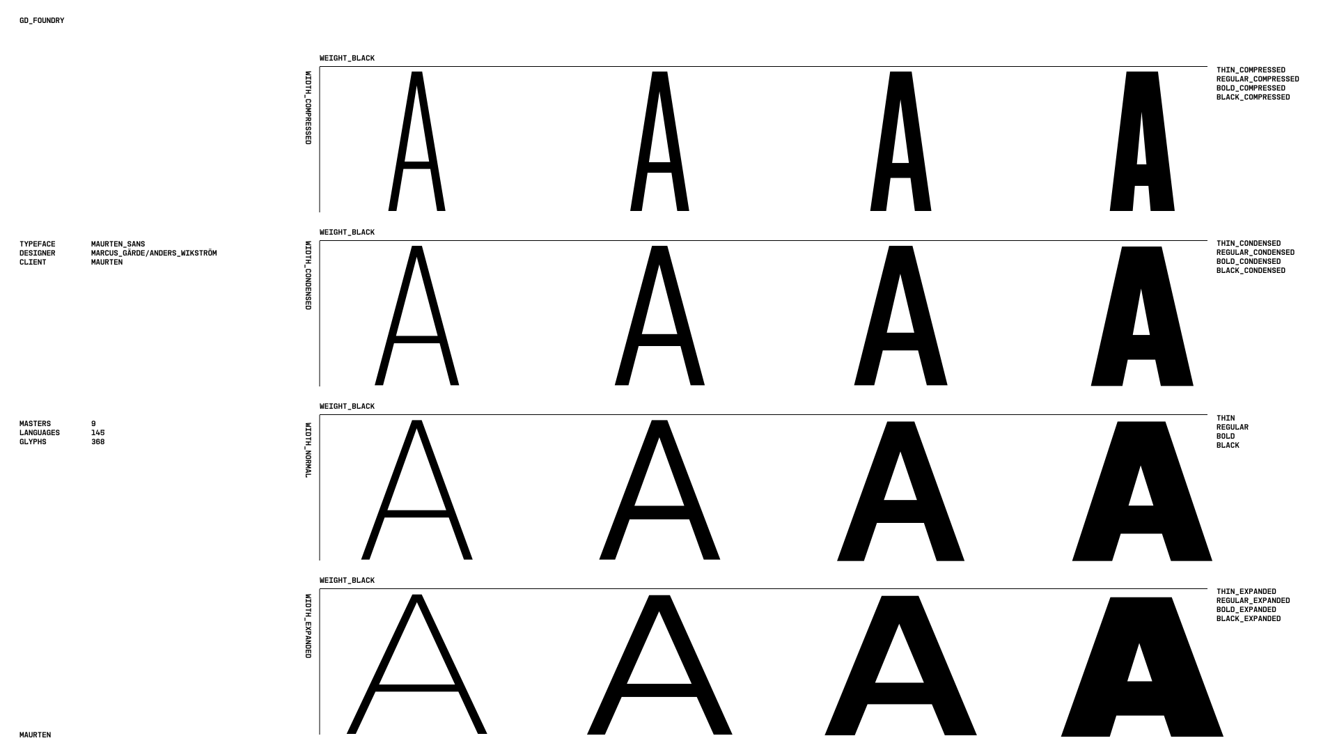
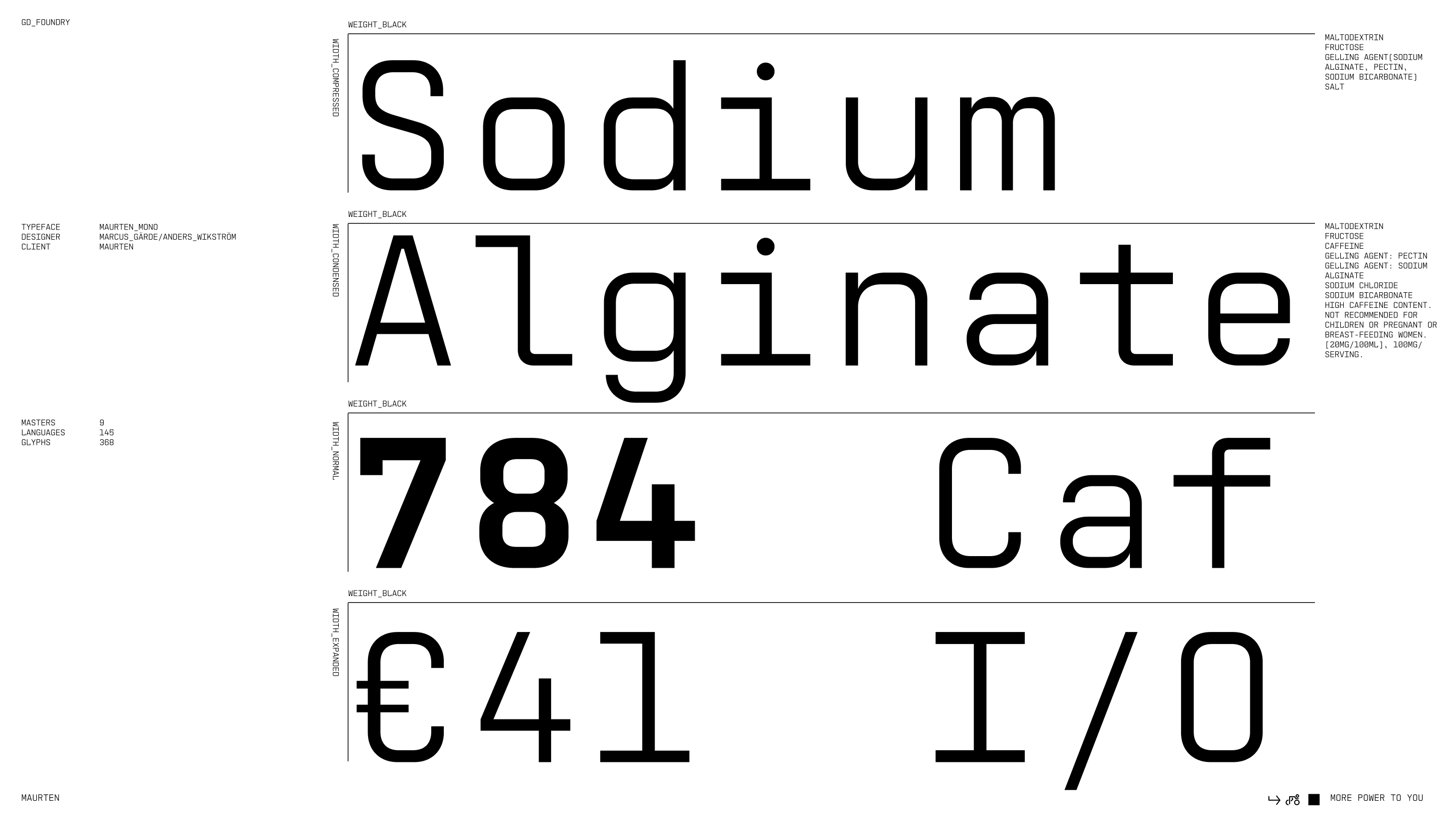
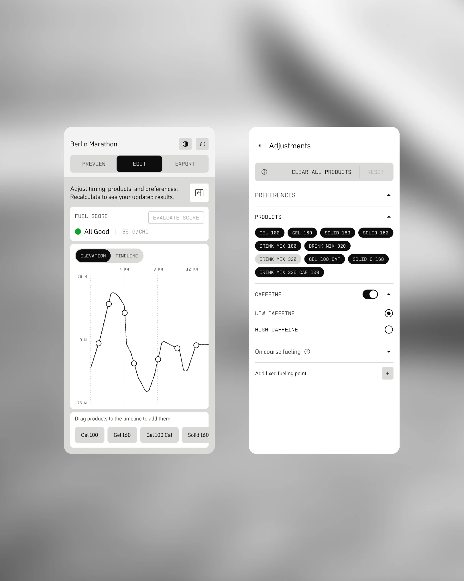
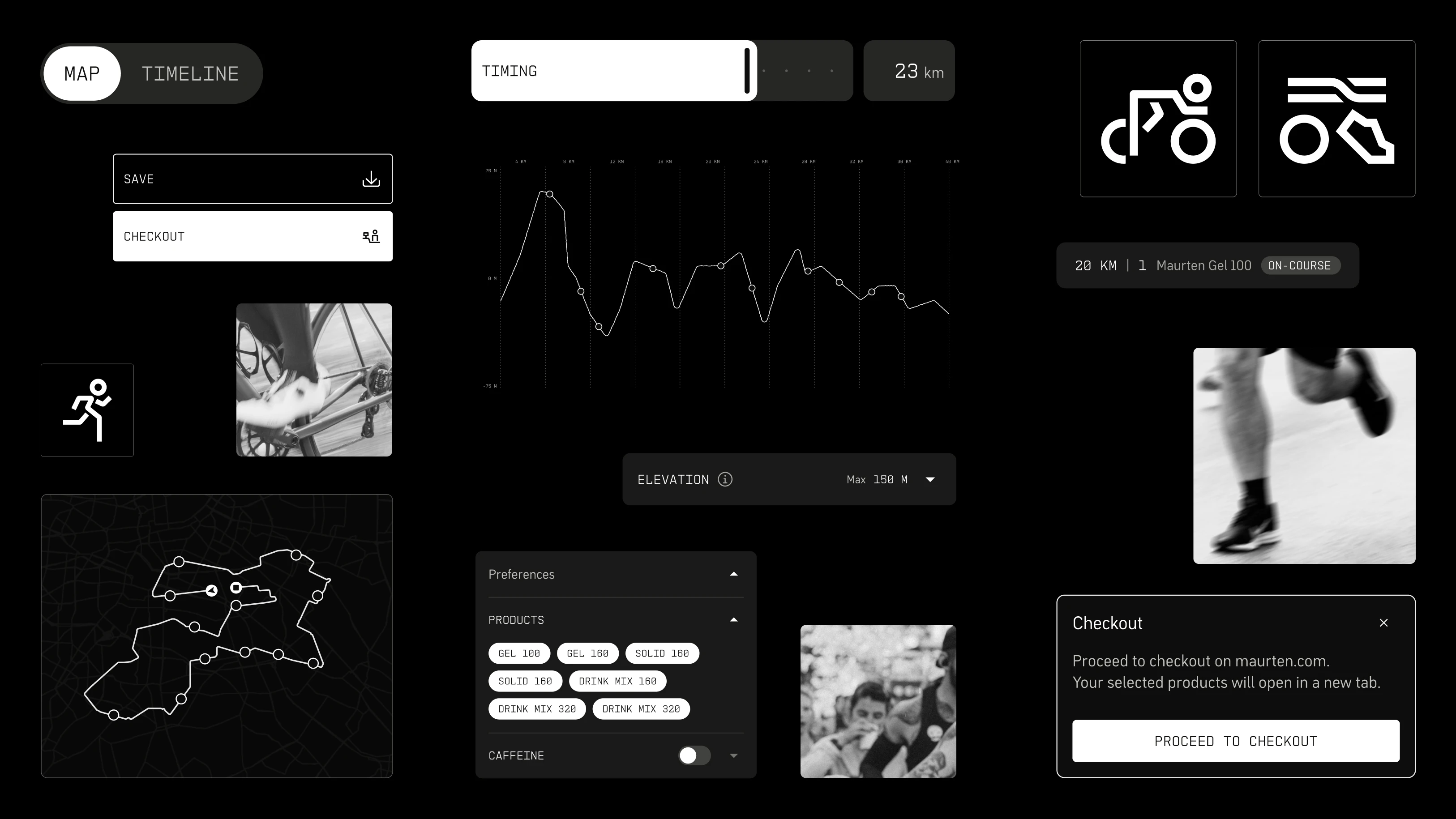
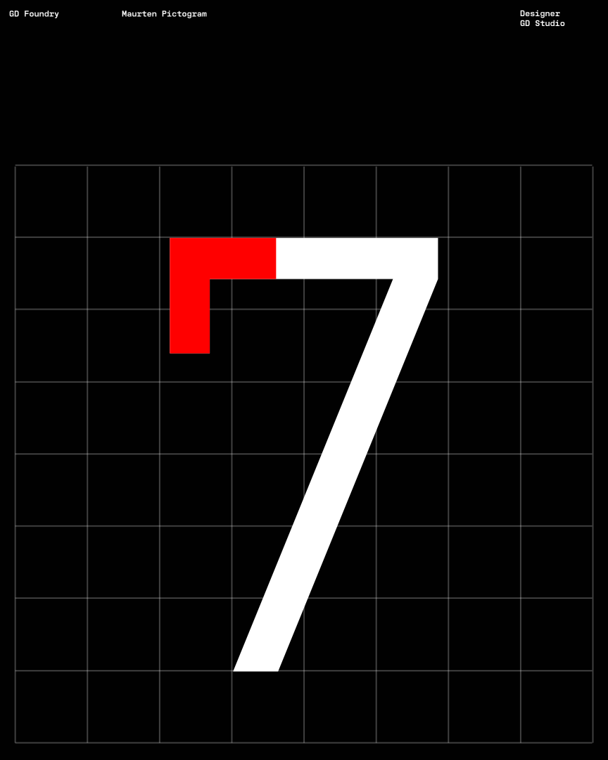
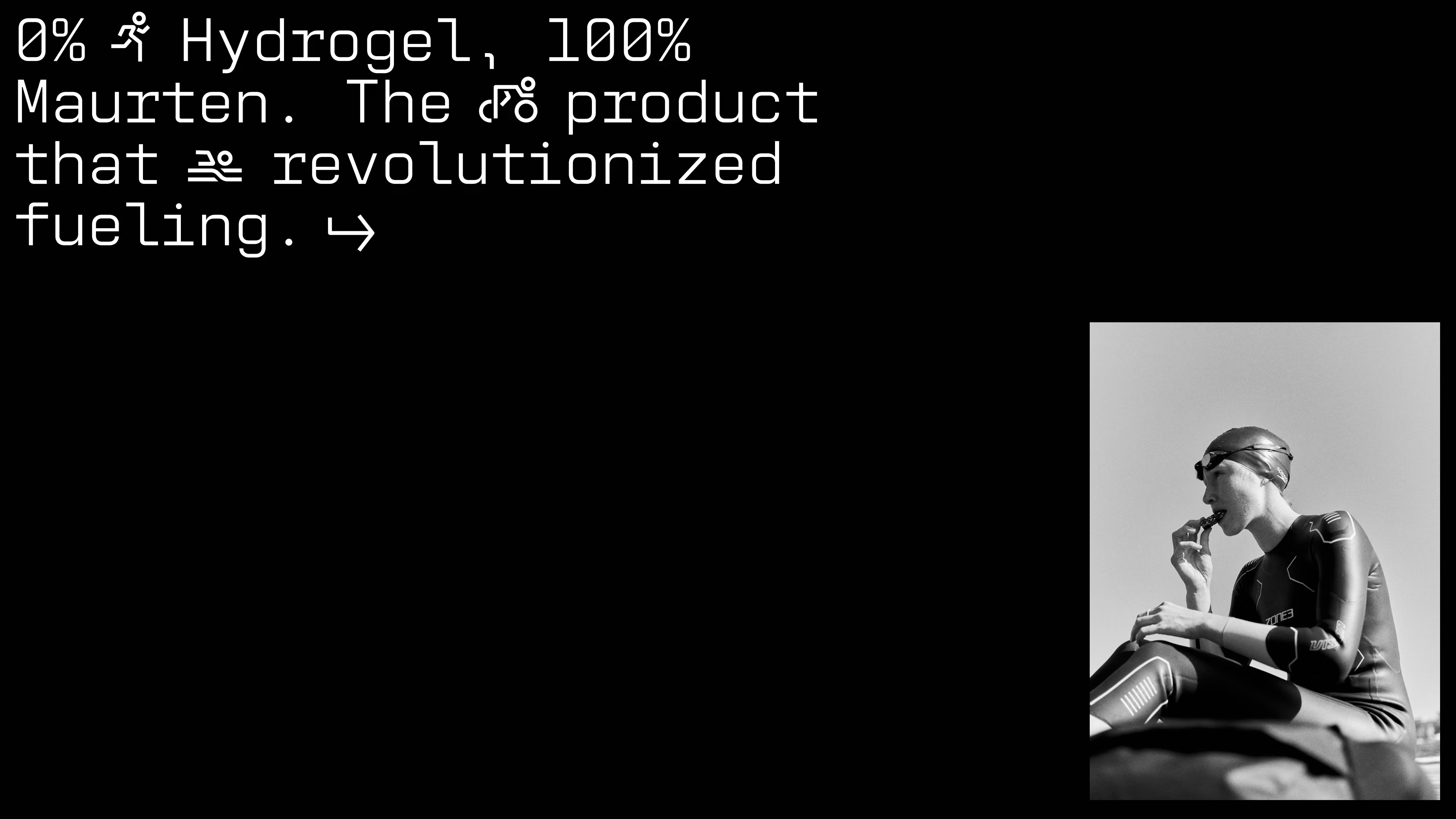
Get in touchTo support Maurten's evolving brand, we expanded their existing typeface into a flexible bespoke system — two new weights, Light and Black, plus Condensed and Wide widths. Every variant was refined for consistency, balance and clarity.
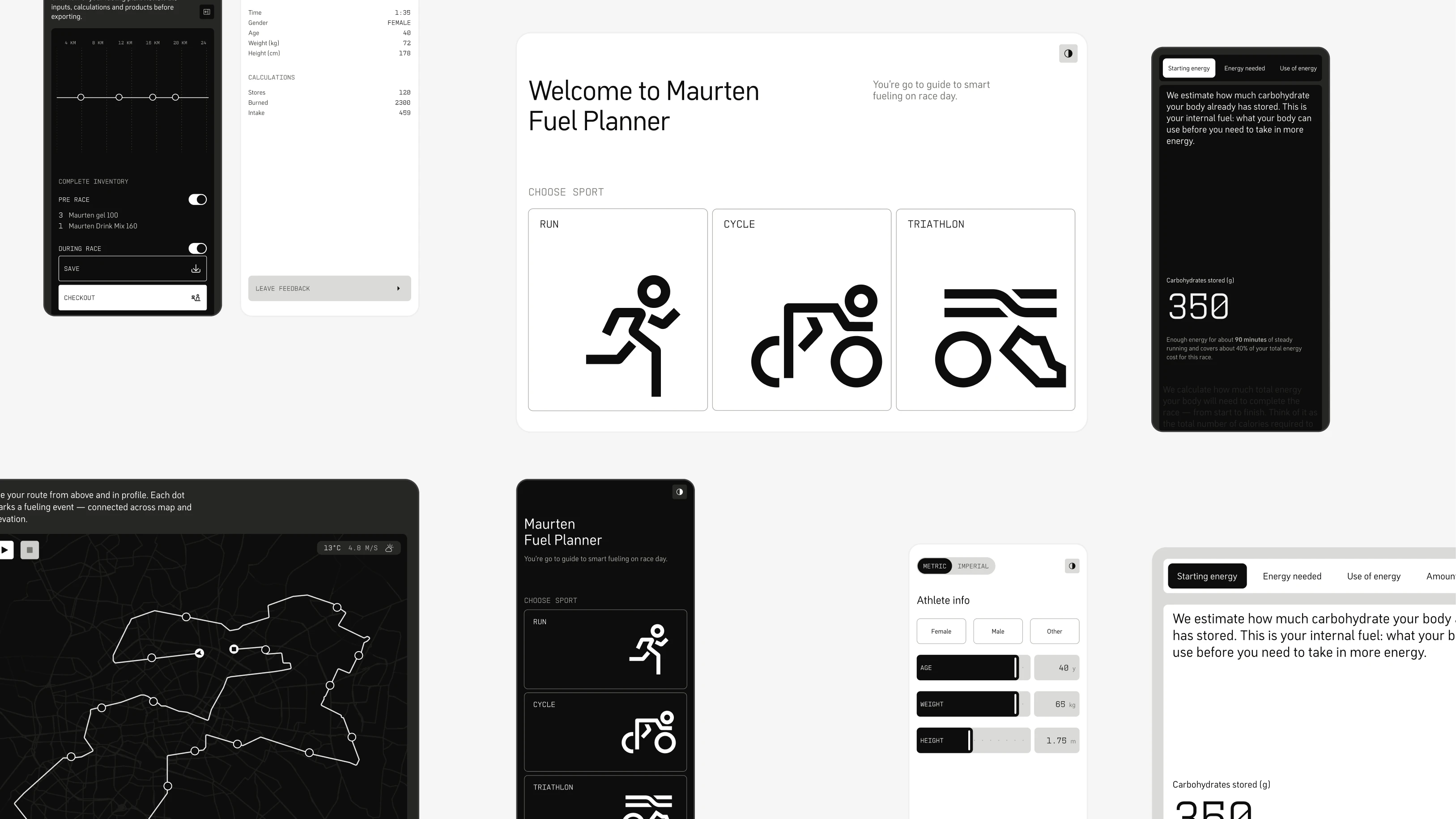
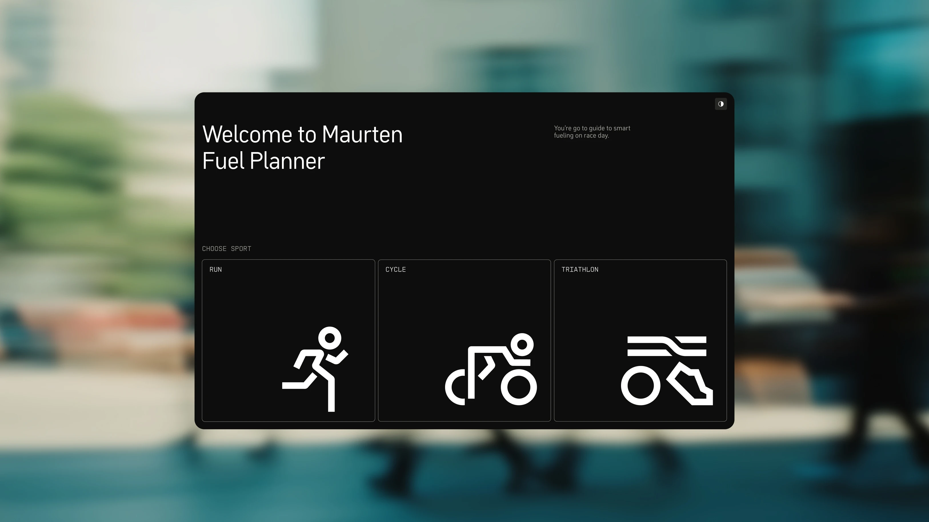
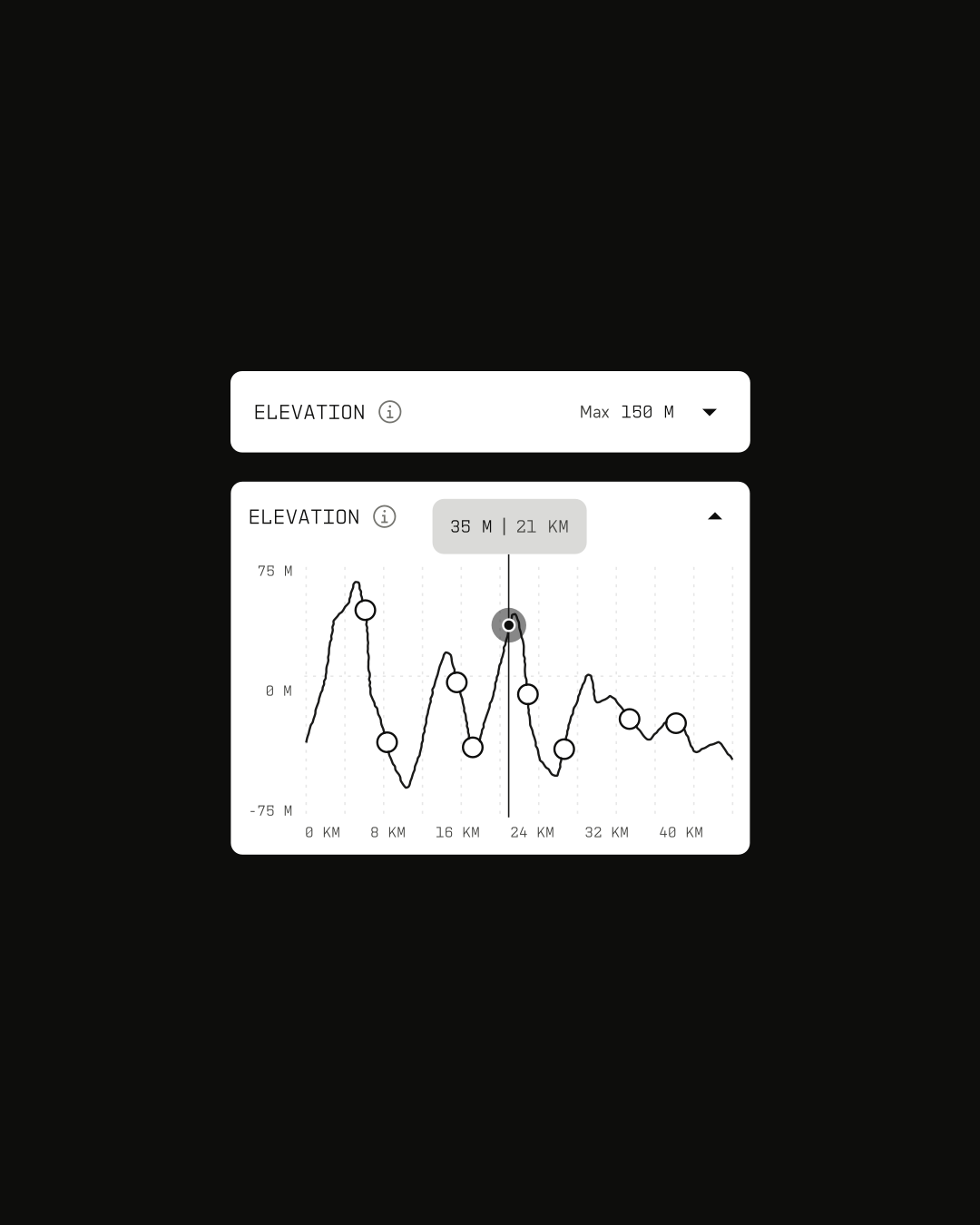
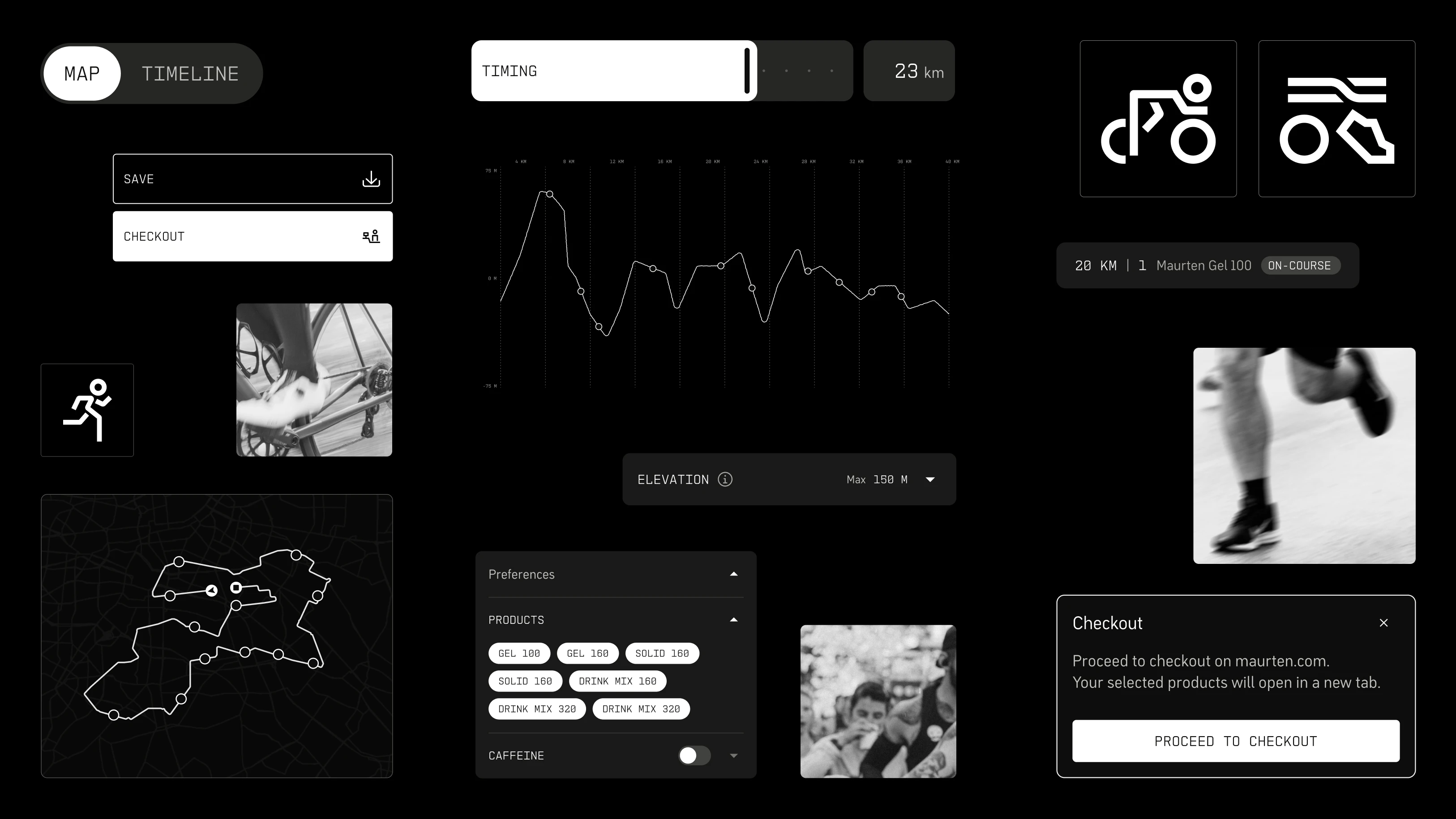
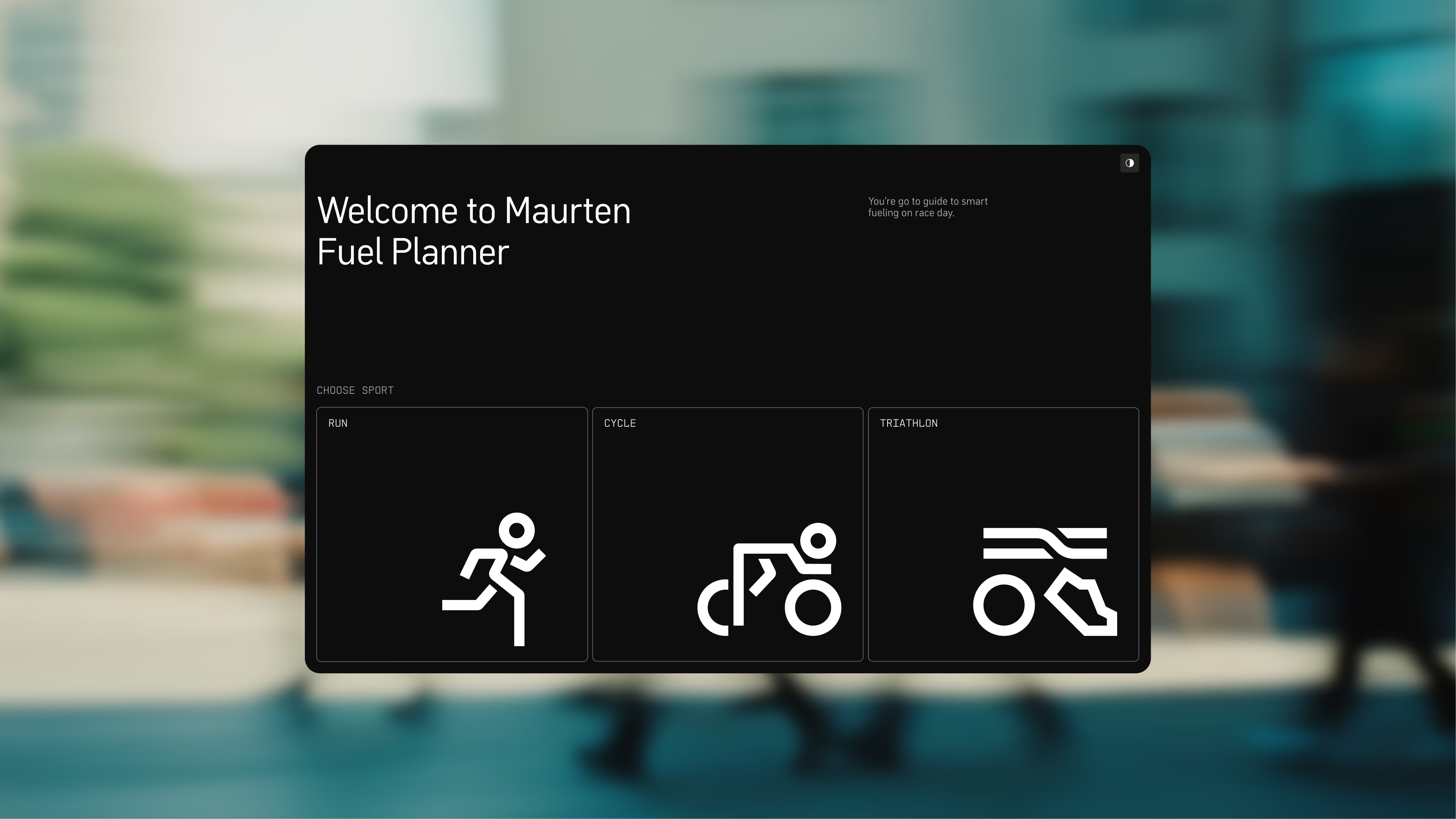
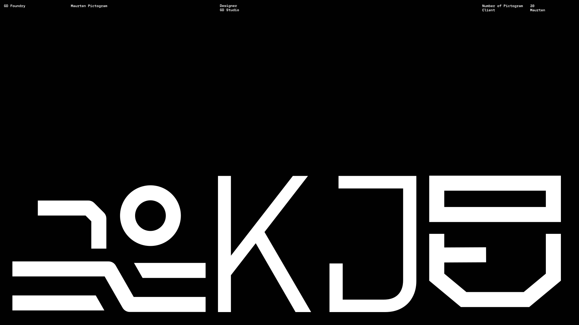
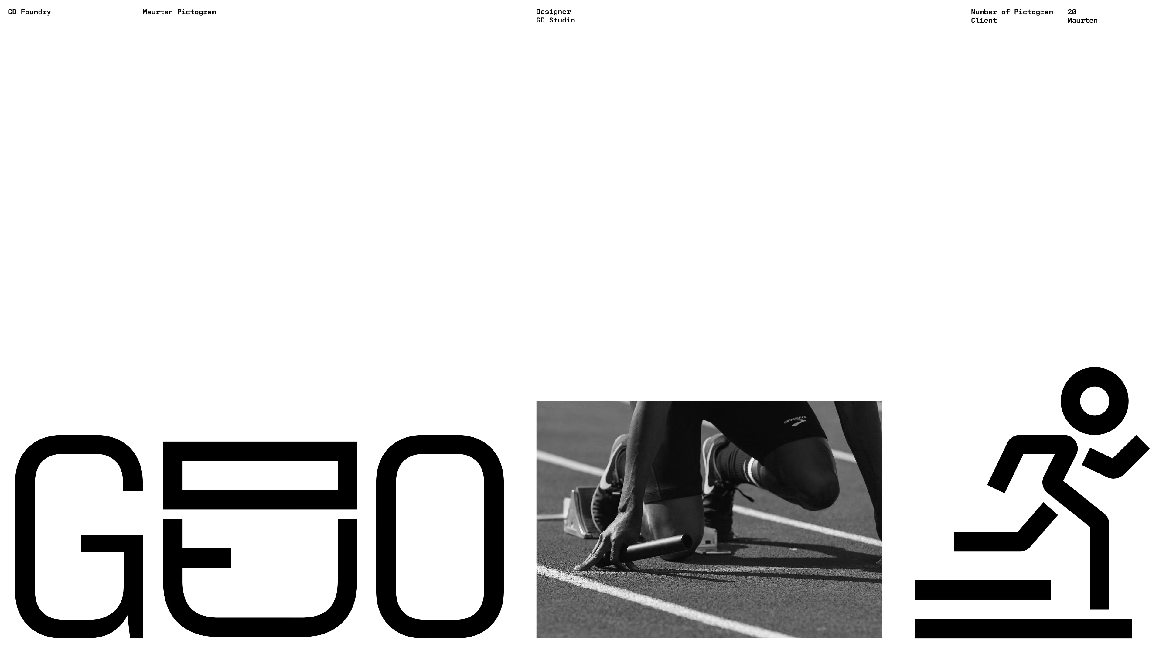
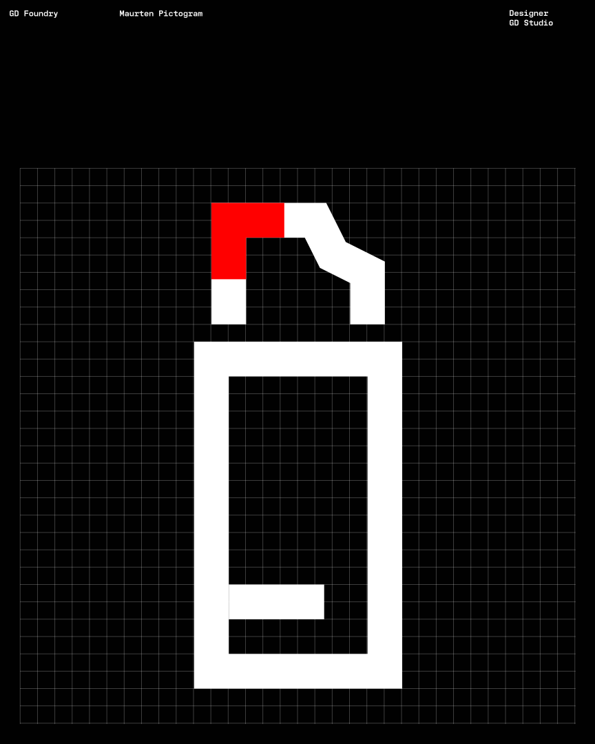
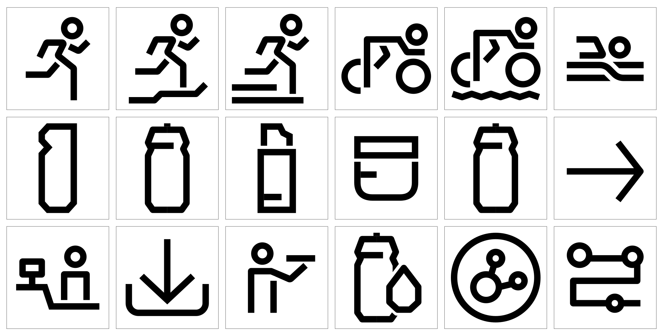
A tailored pictogram set built on the geometry and angles of Maurten Mono, so icons and type speak the same visual language across every context.
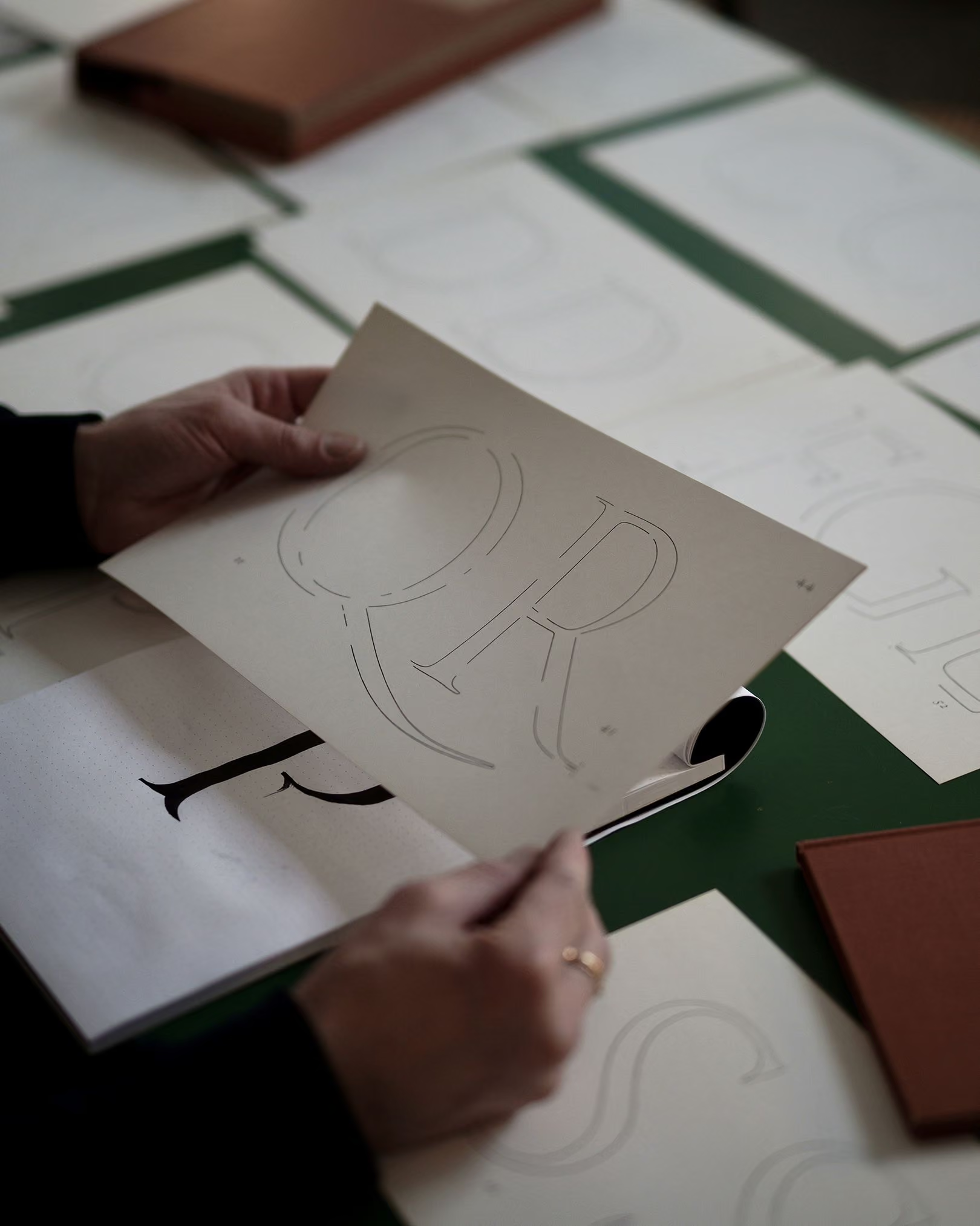
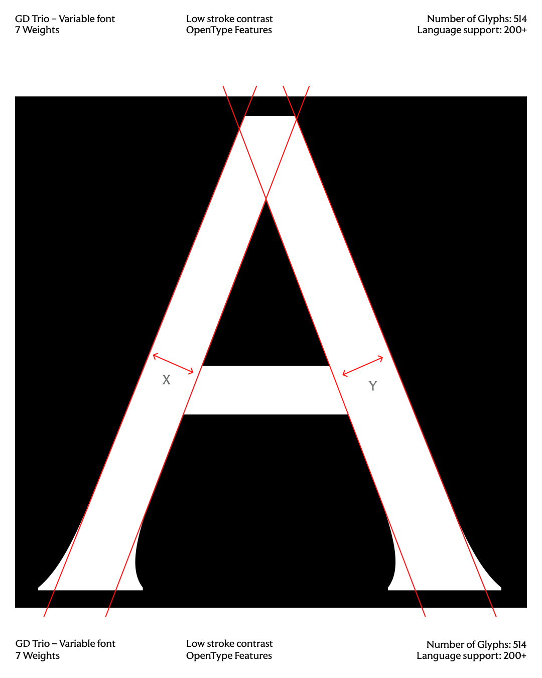
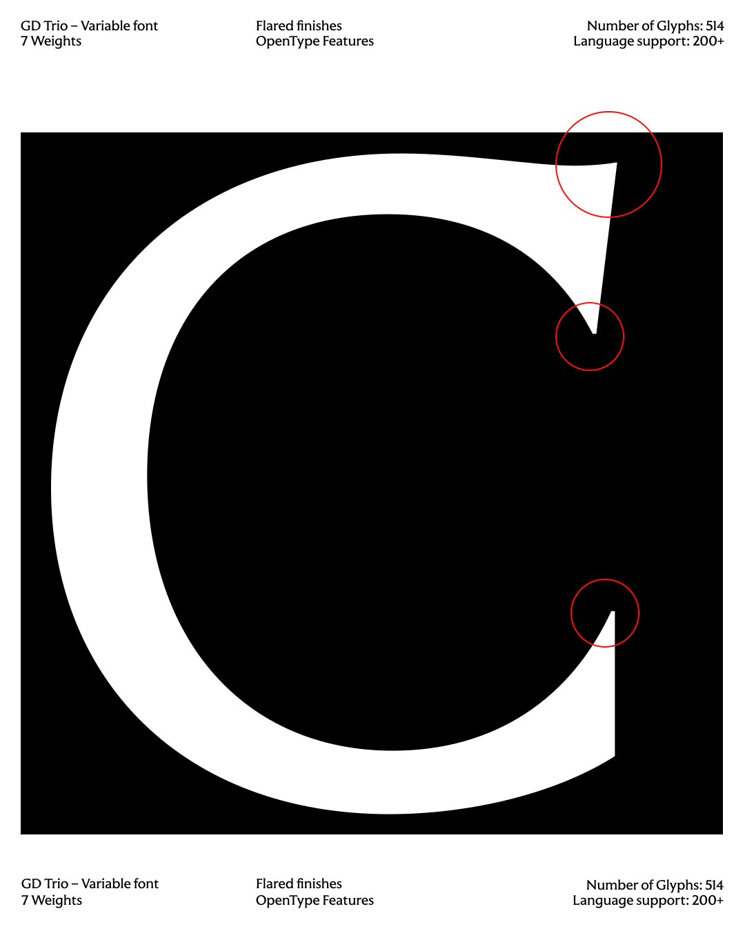
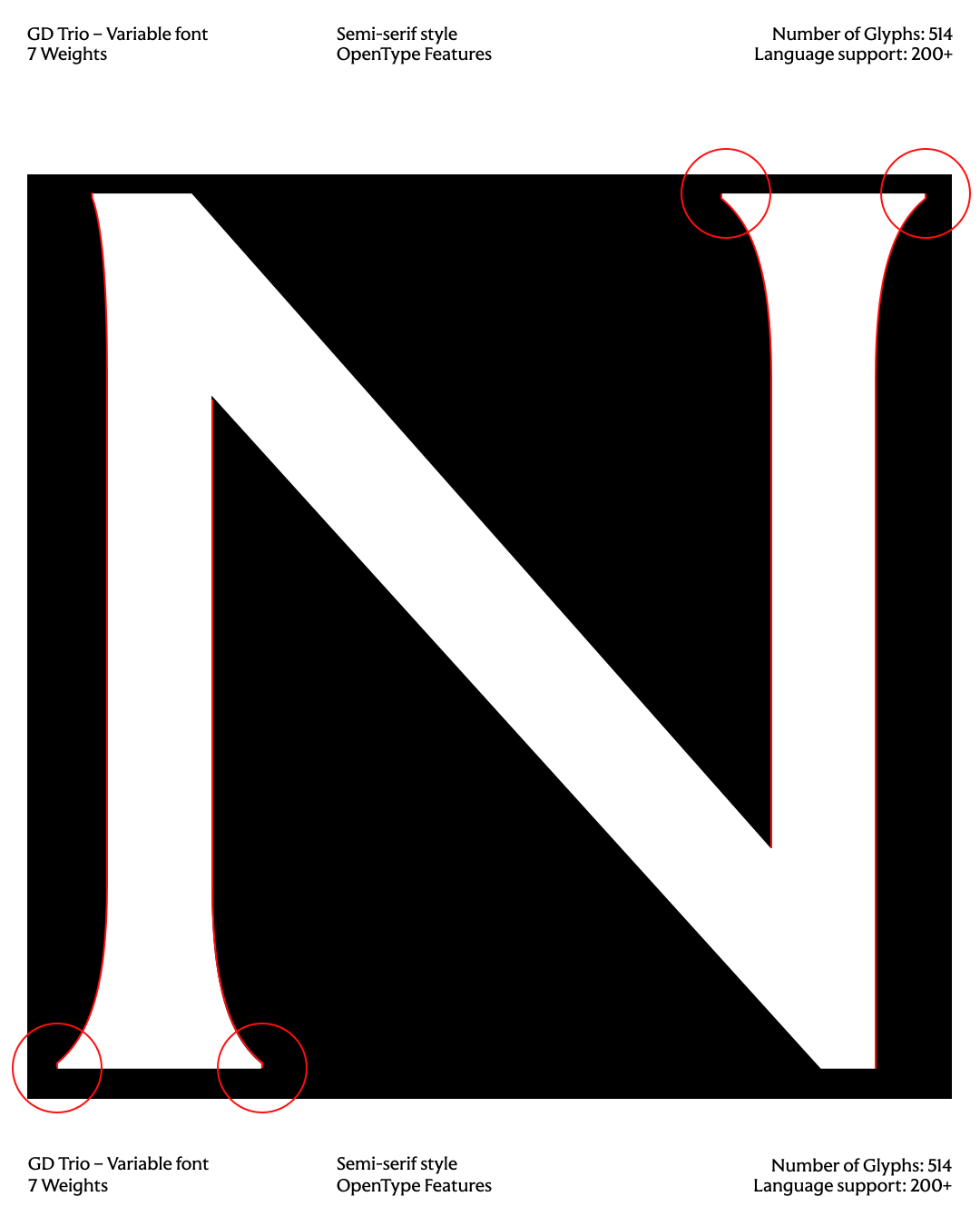
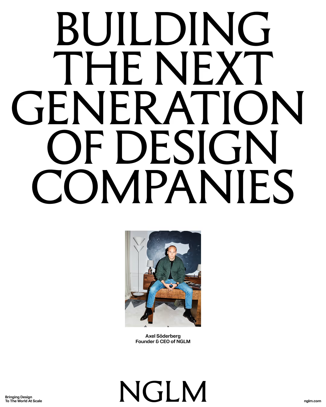
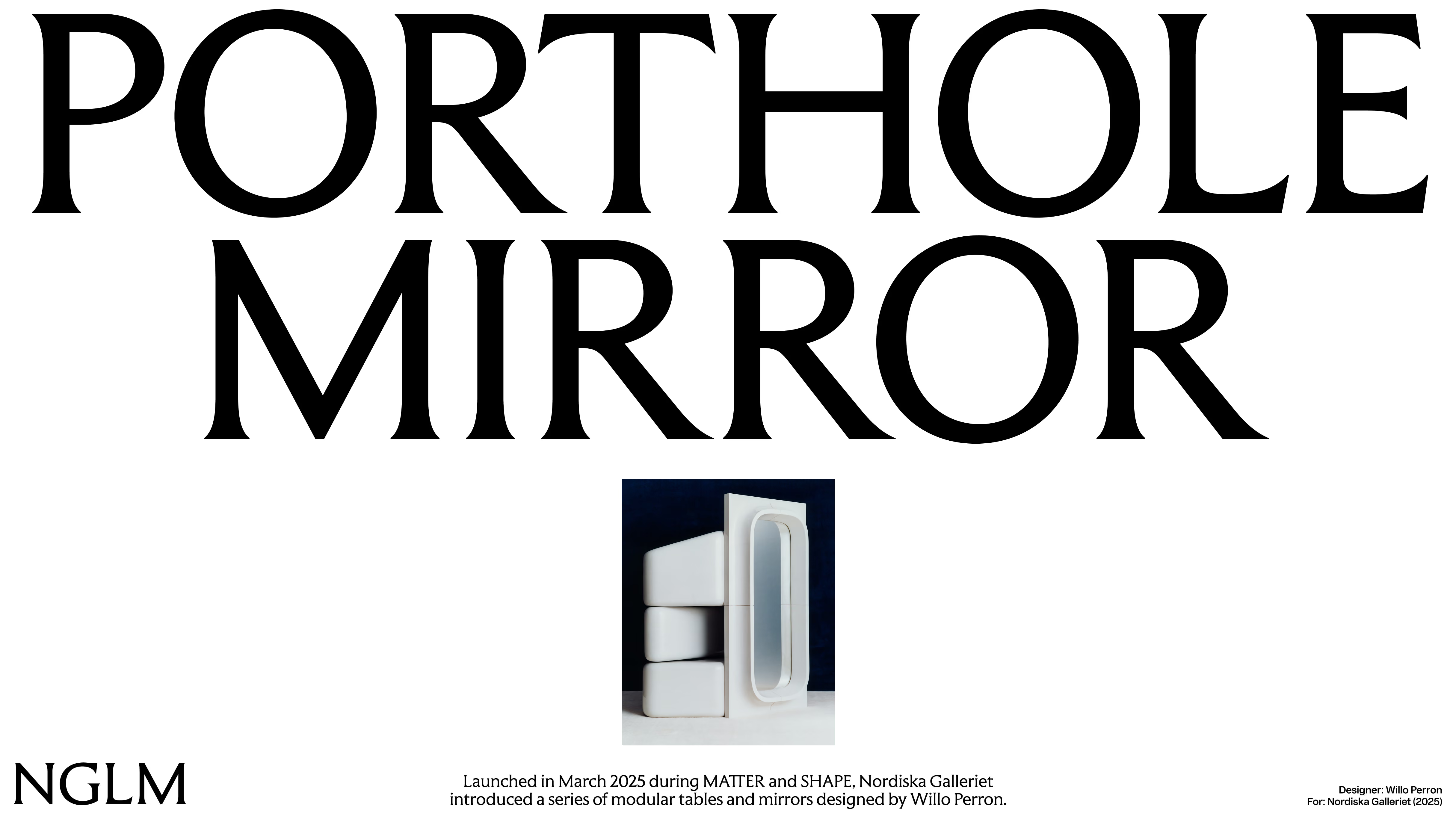
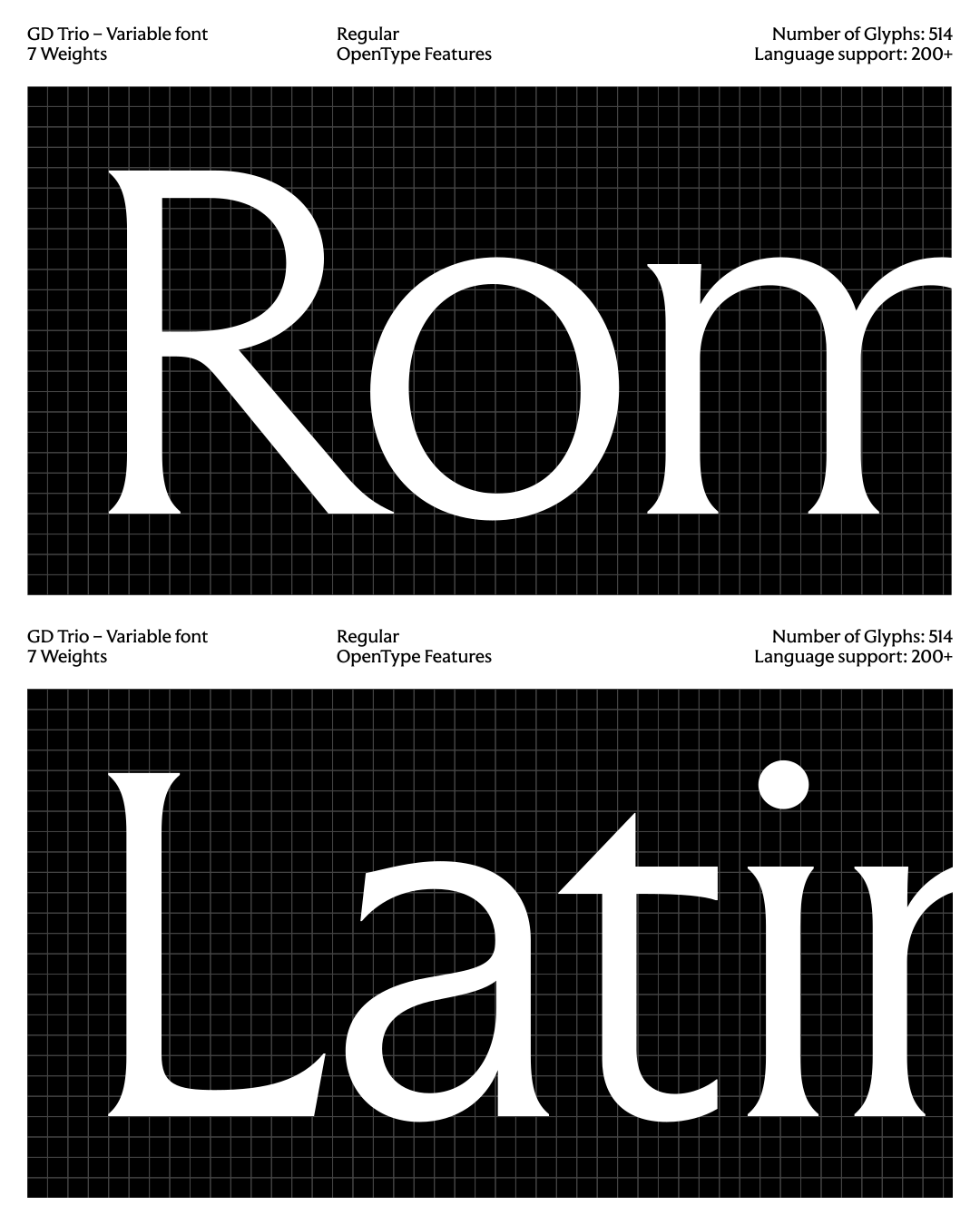
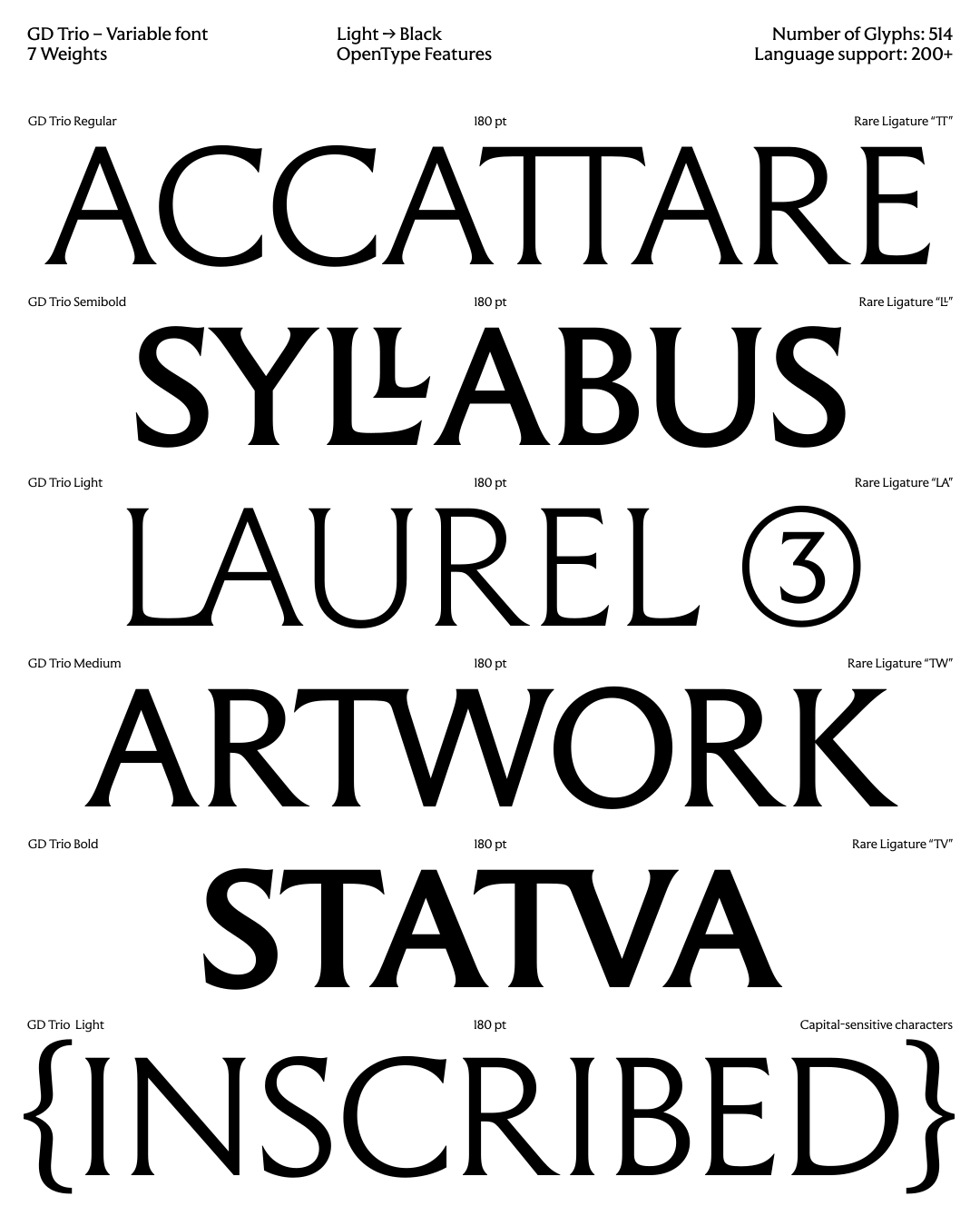
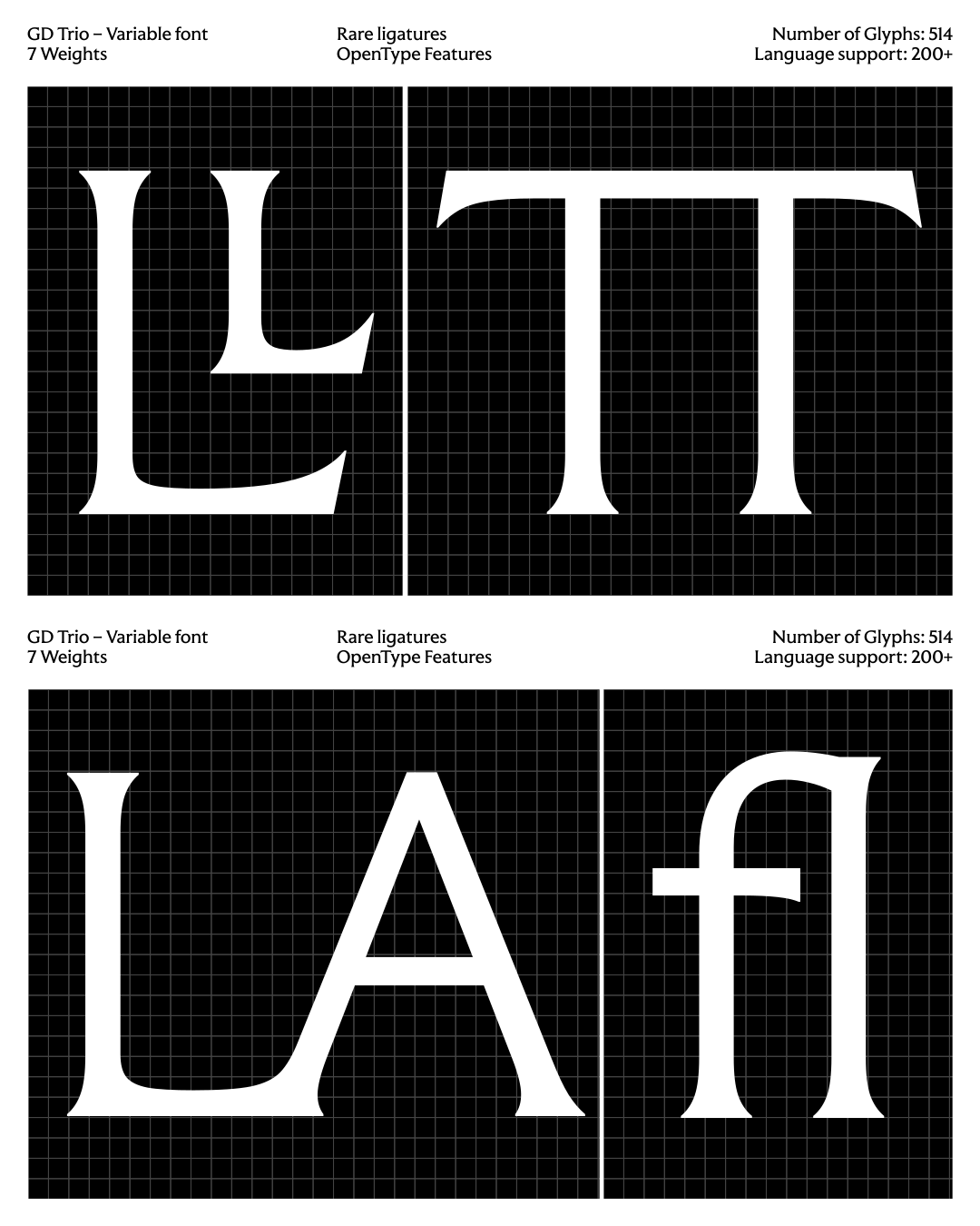
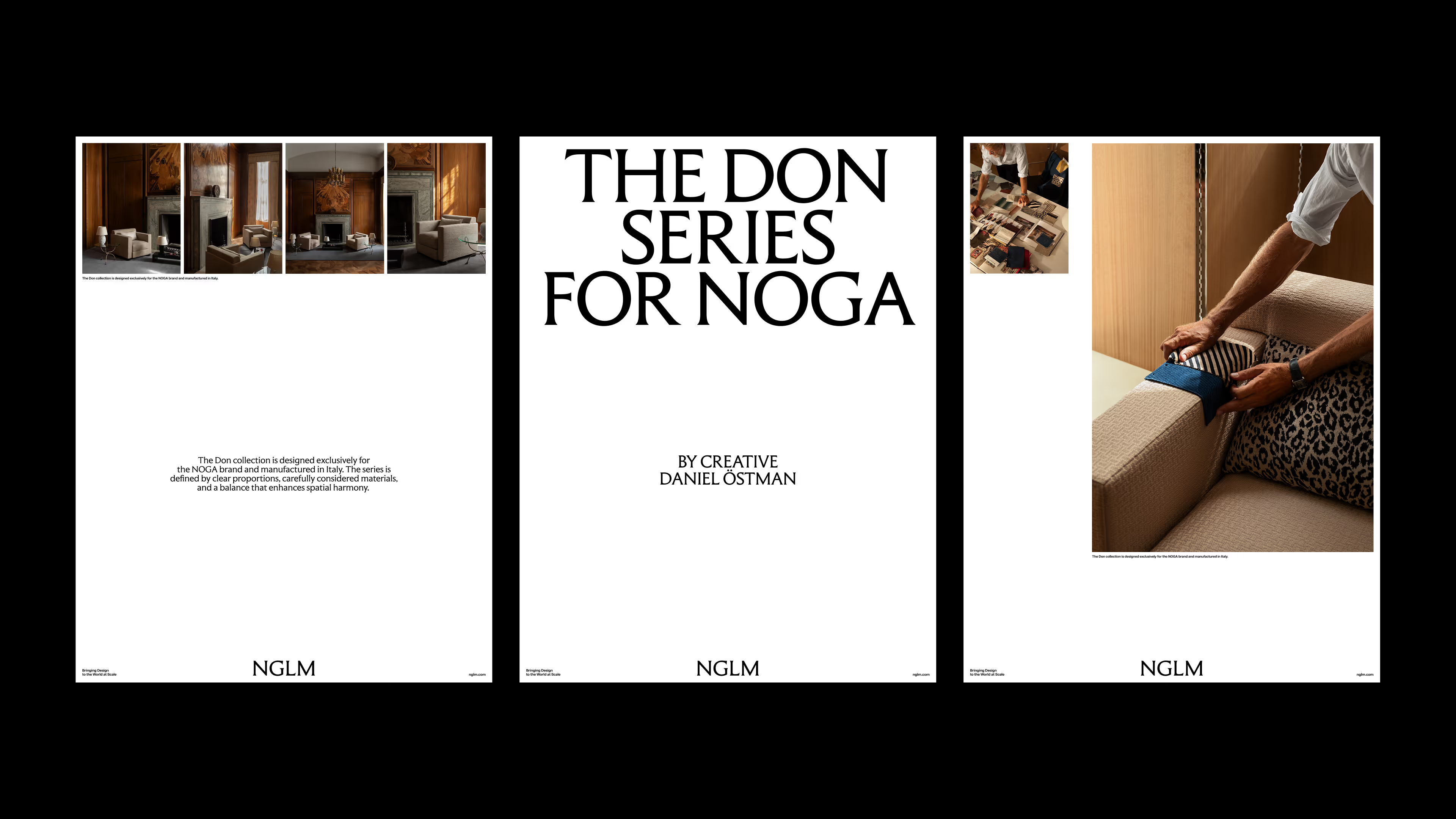
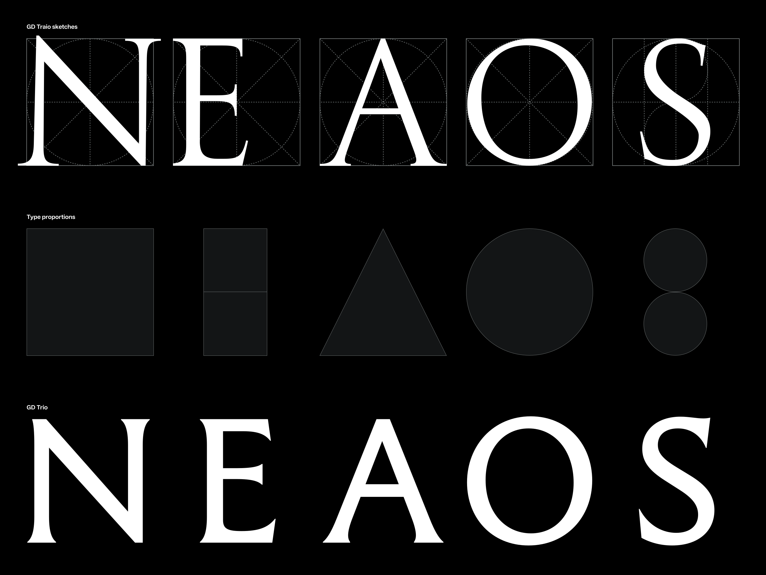
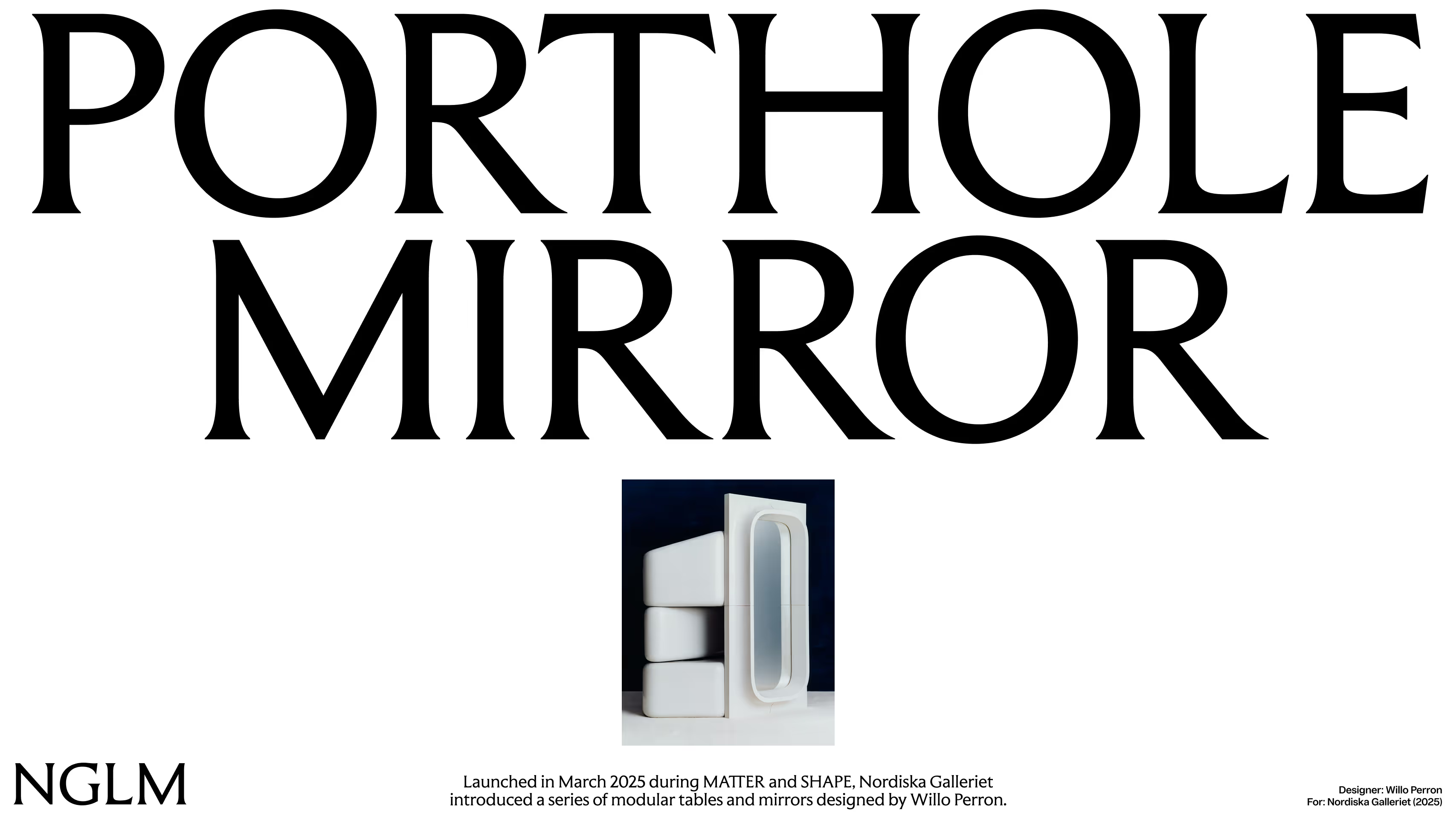
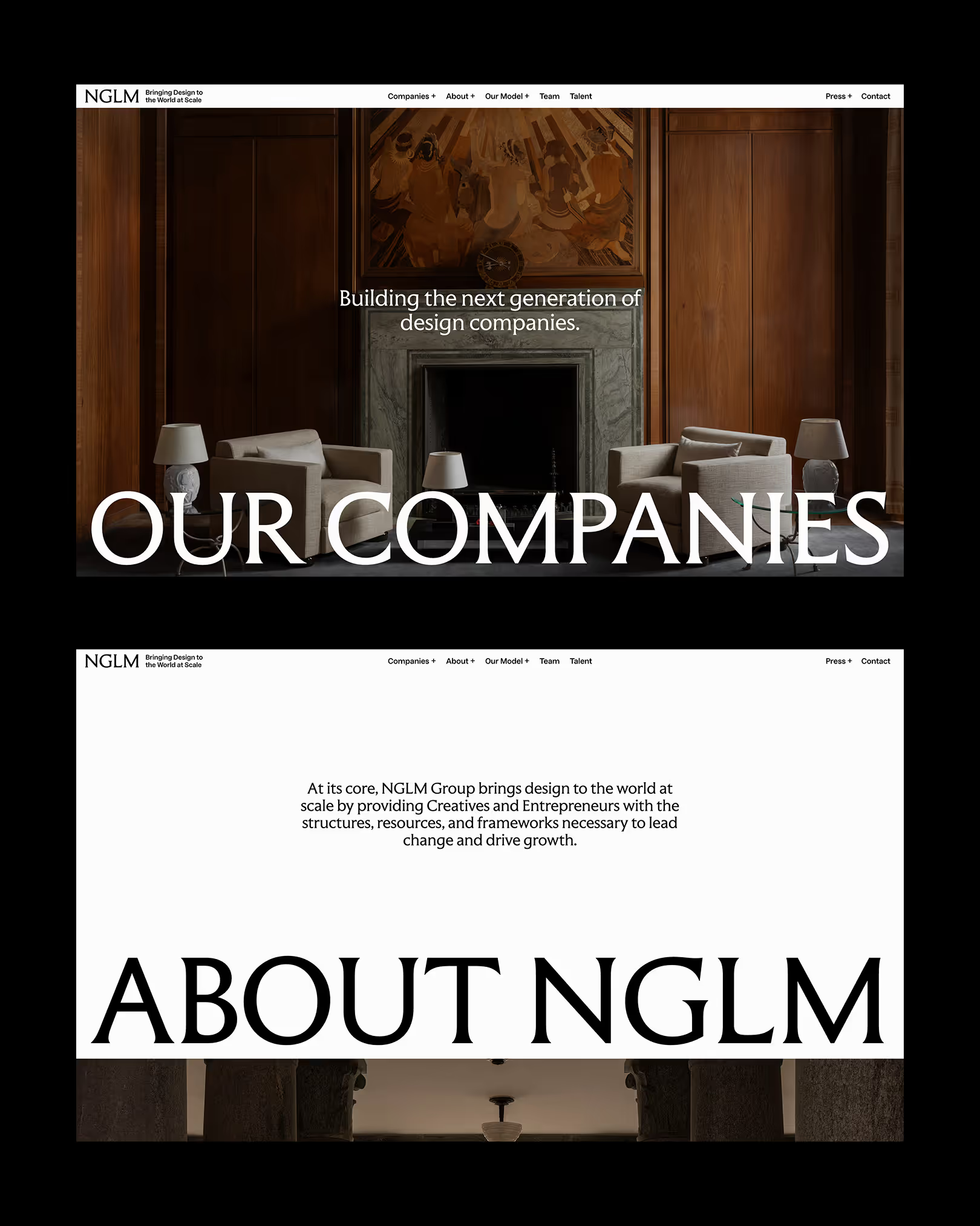
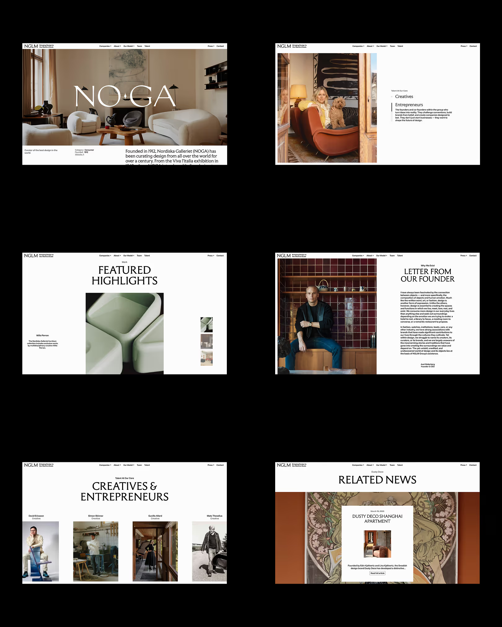
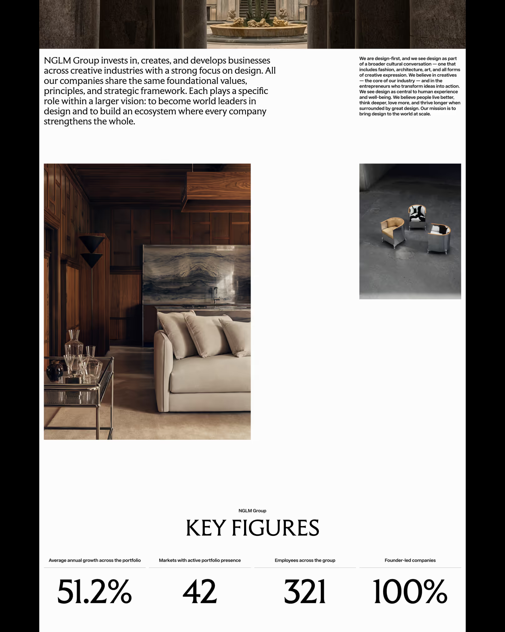
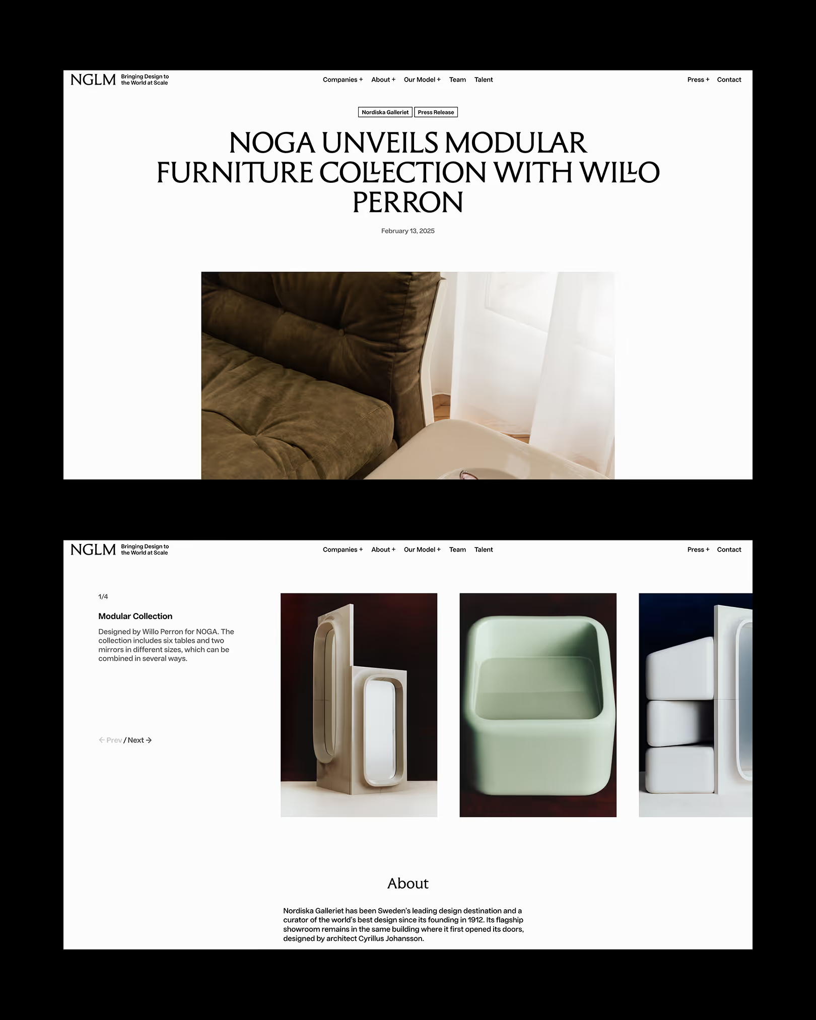
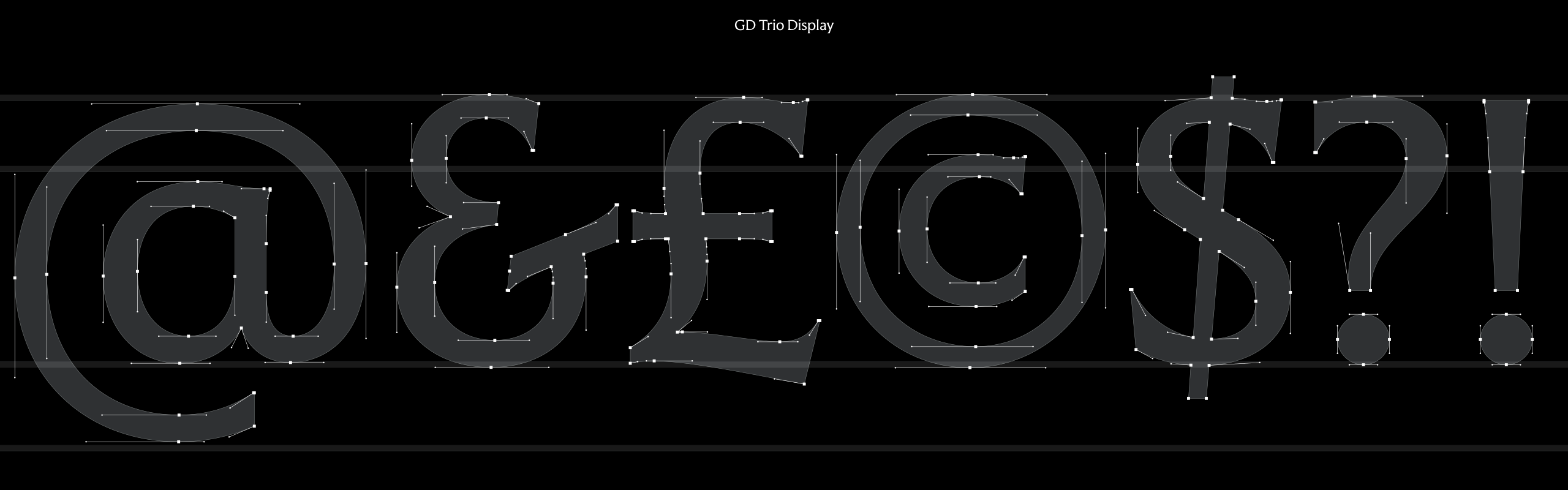
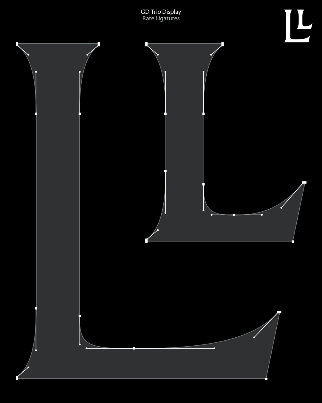
For NGLM we drew GD Trio, inspired by the classical proportions of Roman inscriptions — centuries of typographic history reinterpreted for a contemporary identity with depth, elegance and craft.
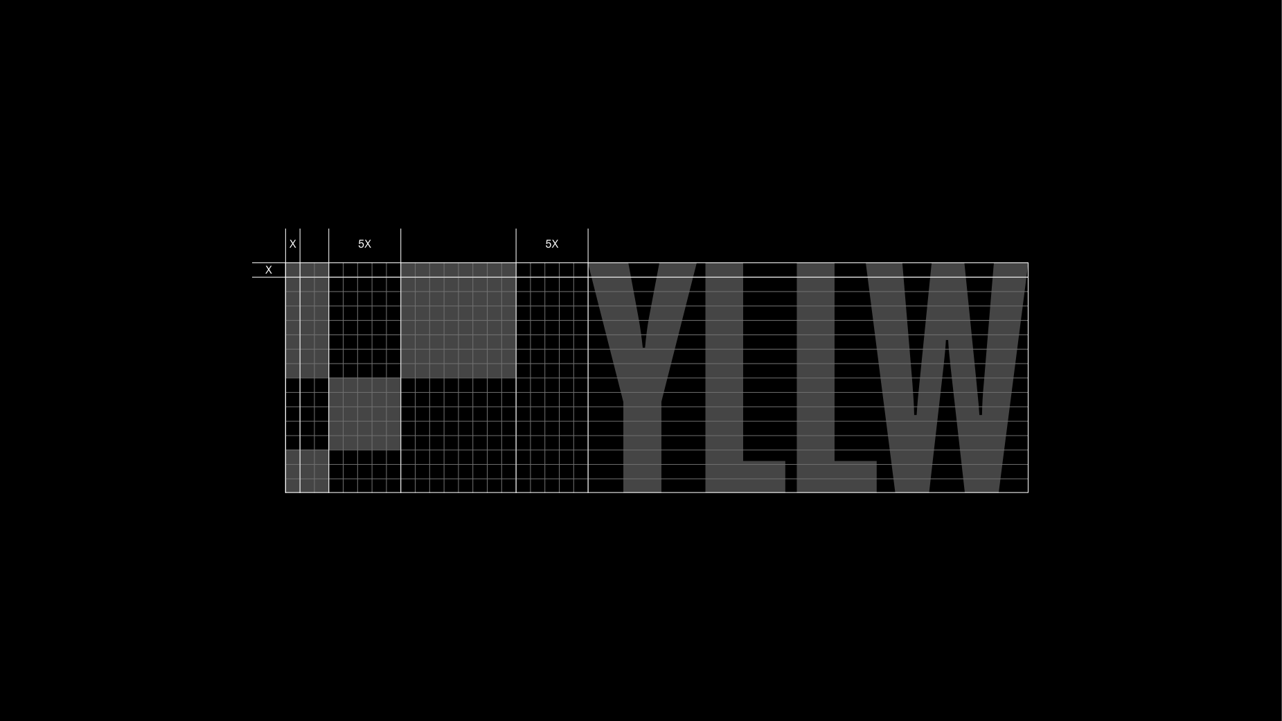
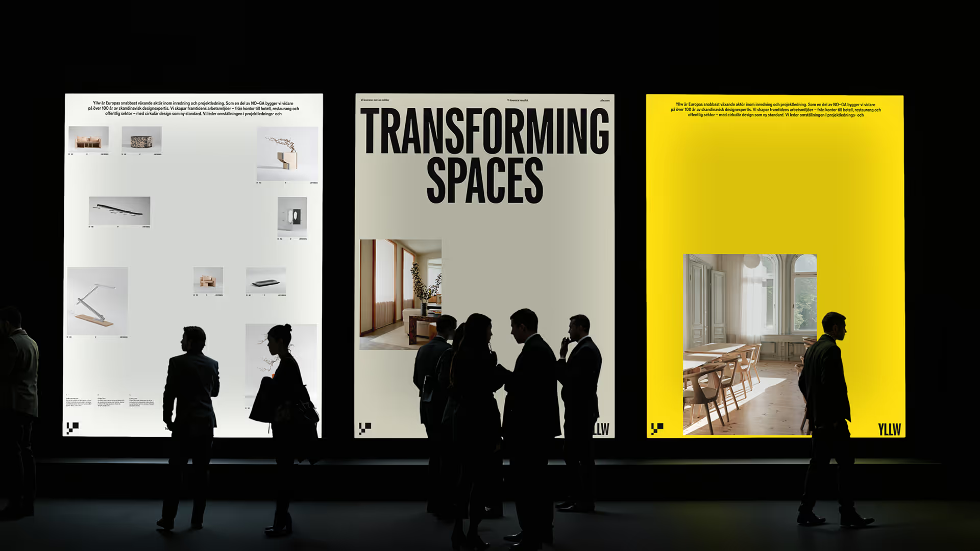
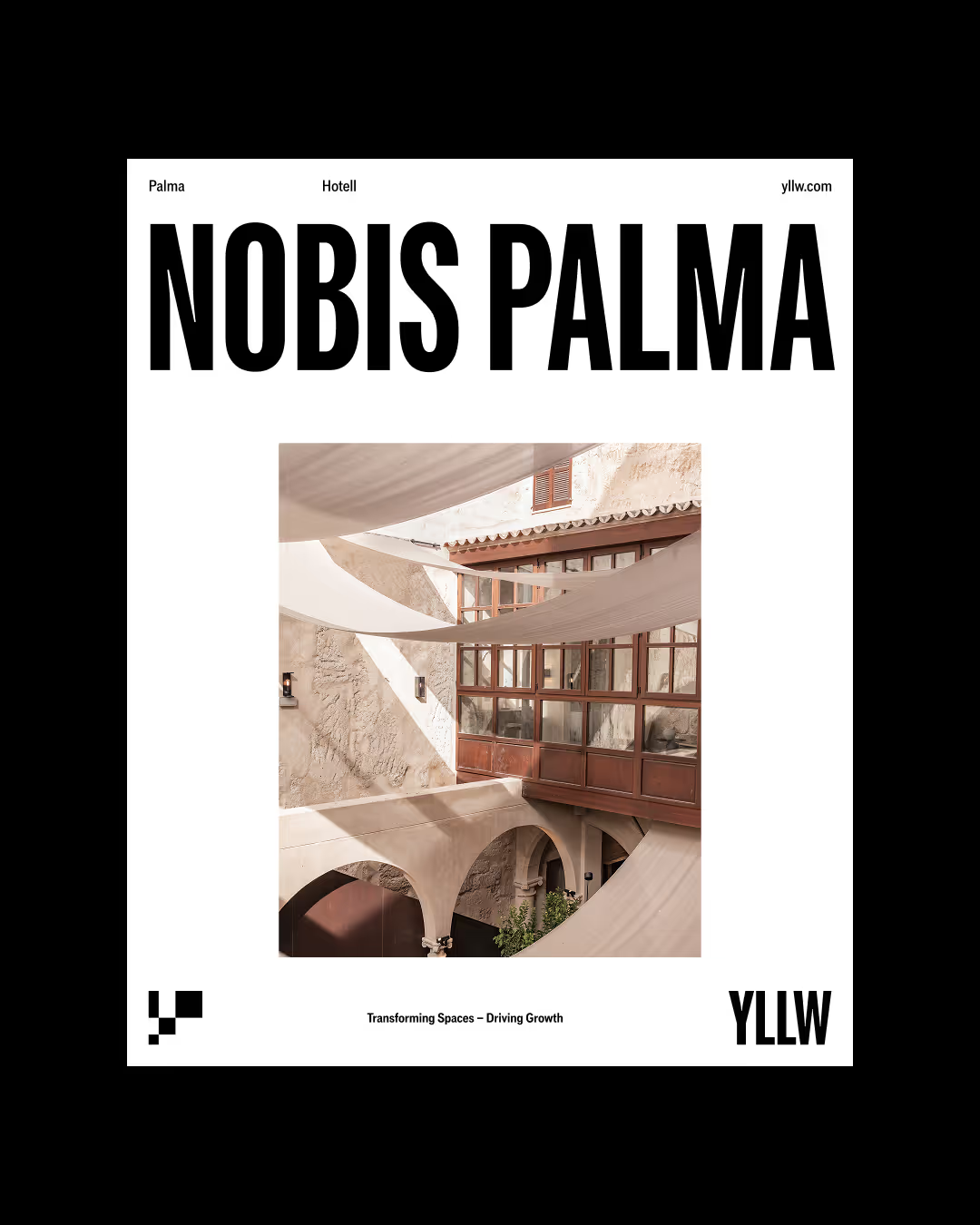
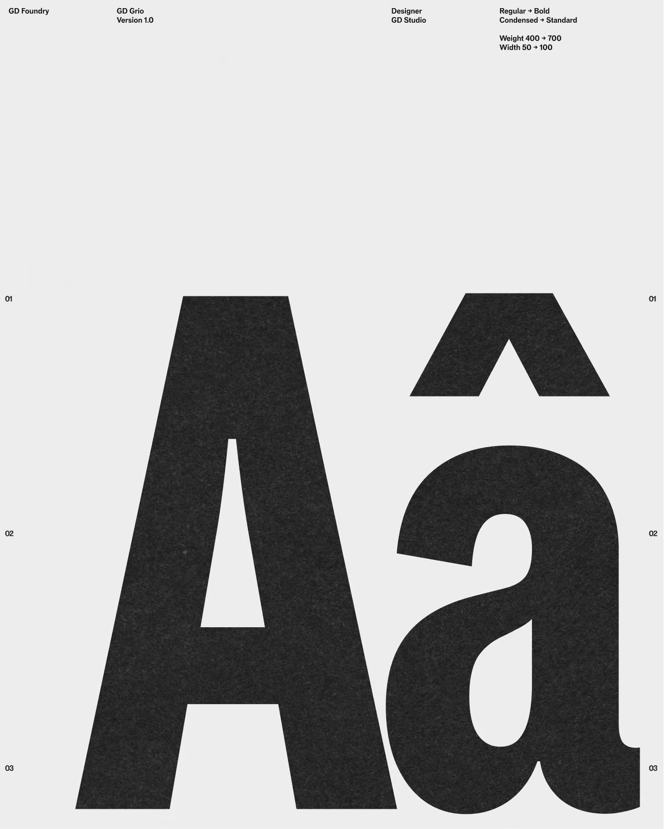
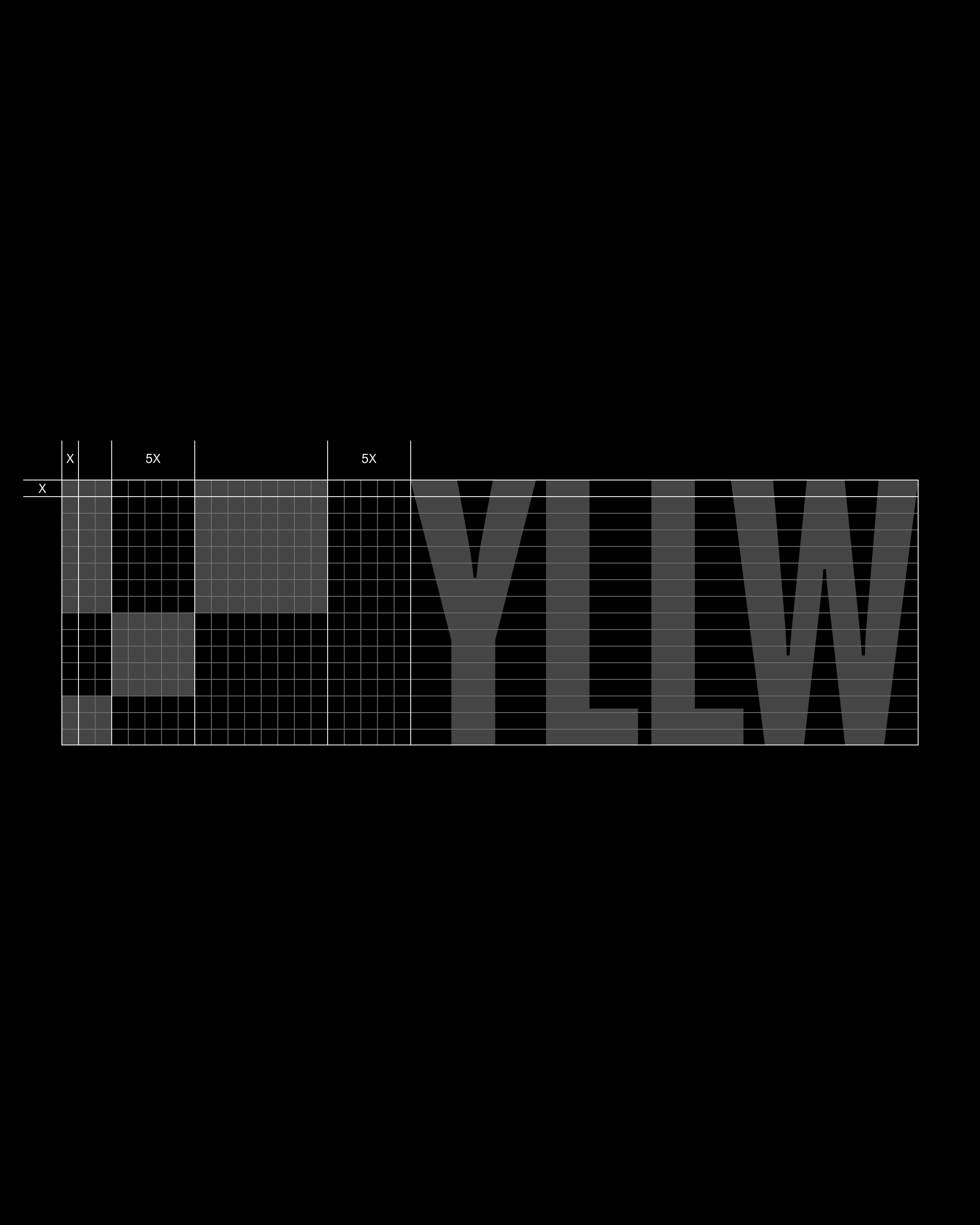
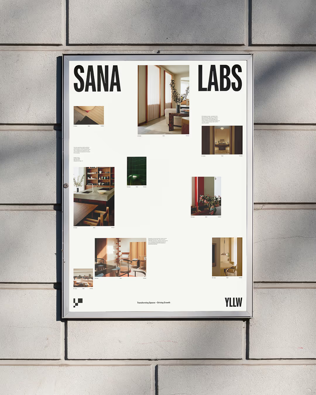
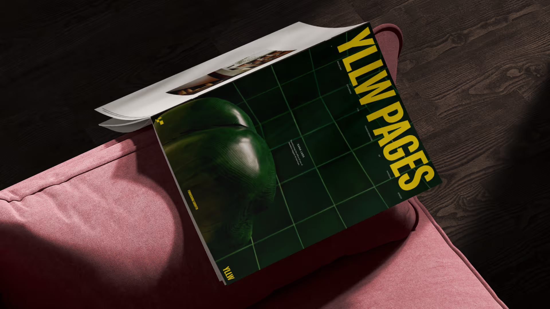
A variable grotesk built around transformation. Designed to shift and respond to its surroundings, it mirrors YLLW's work of reshaping spaces — one voice that moves between many expressions.
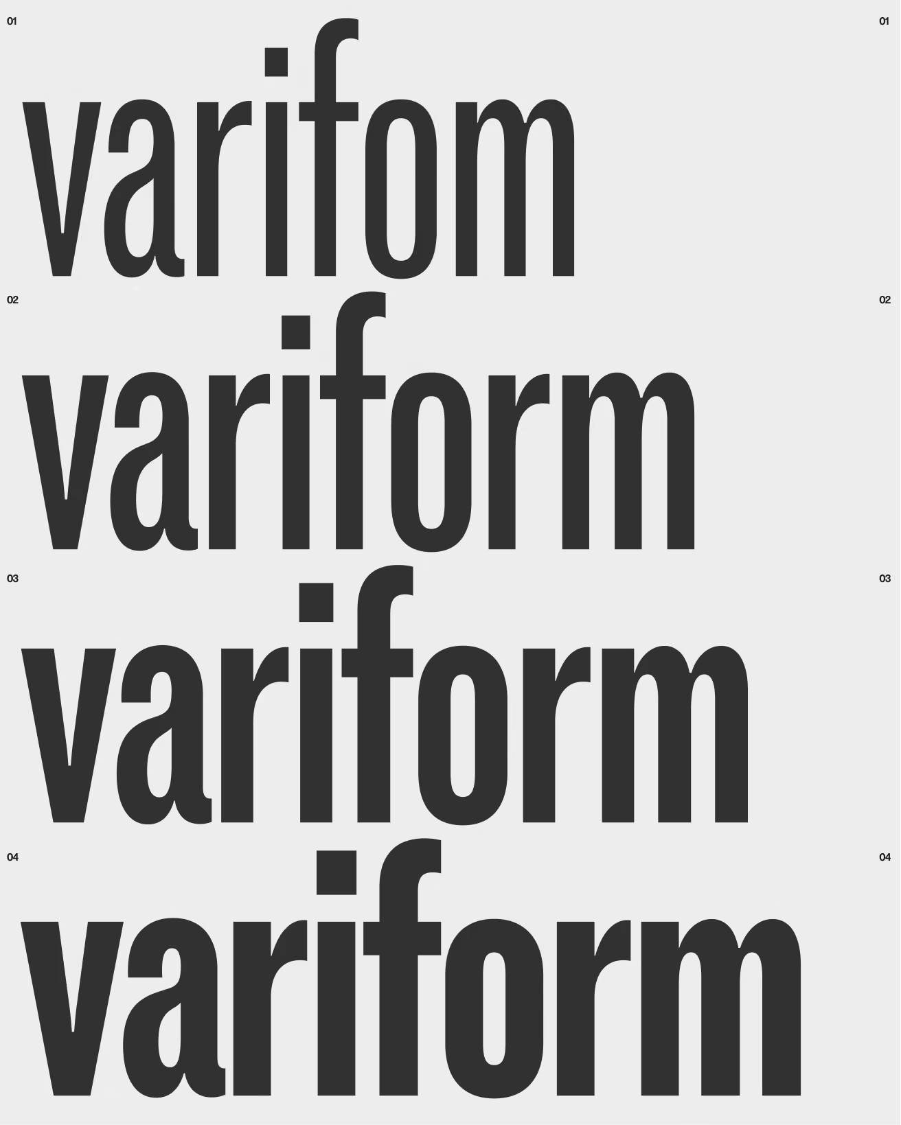
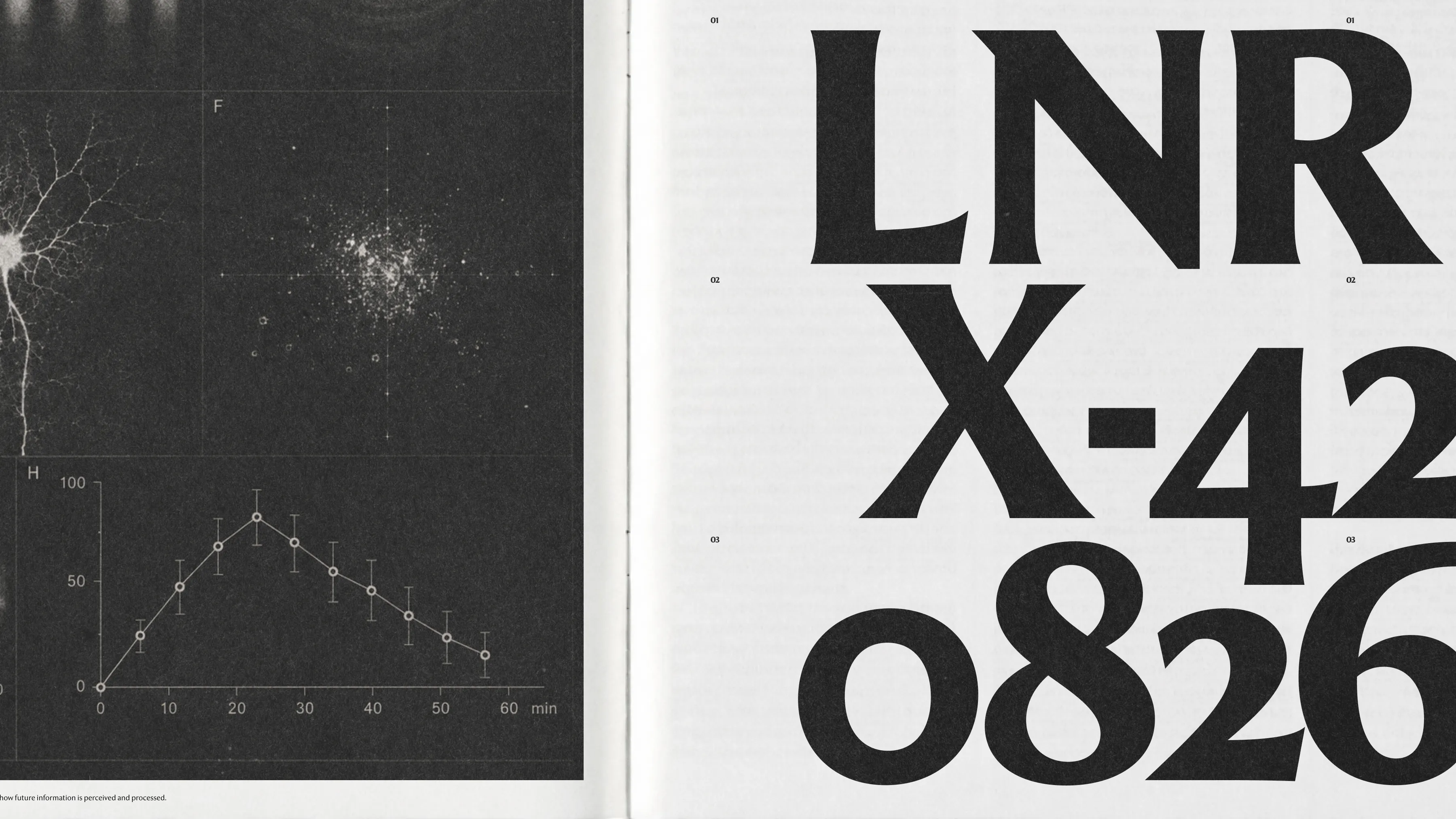
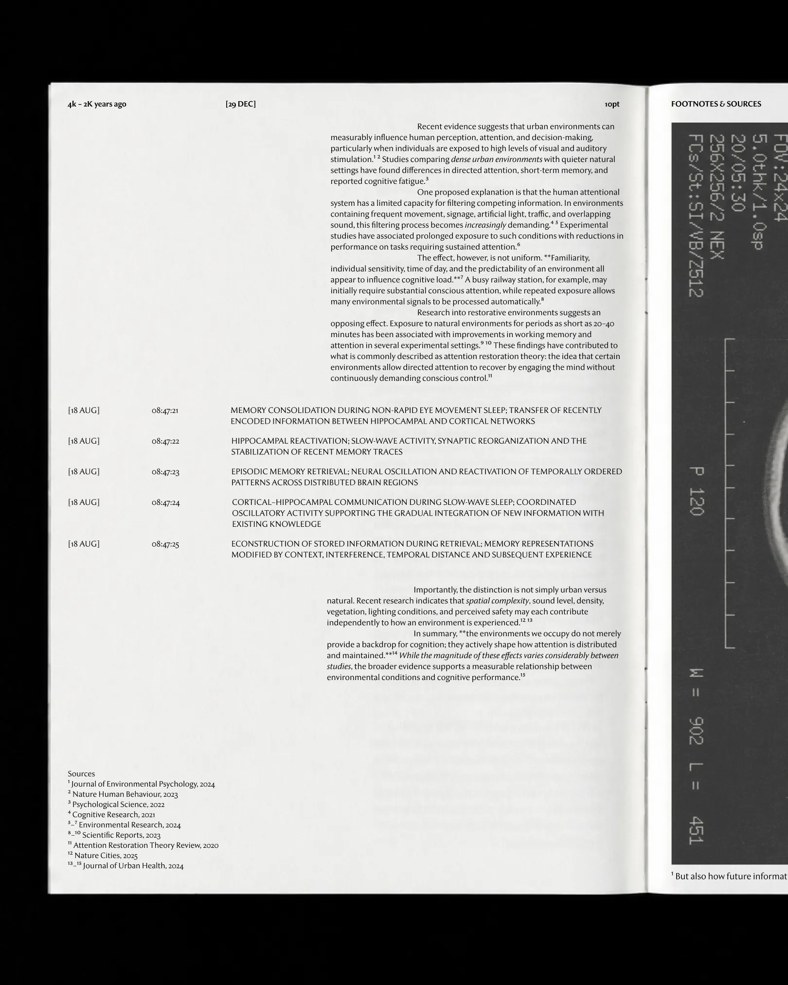
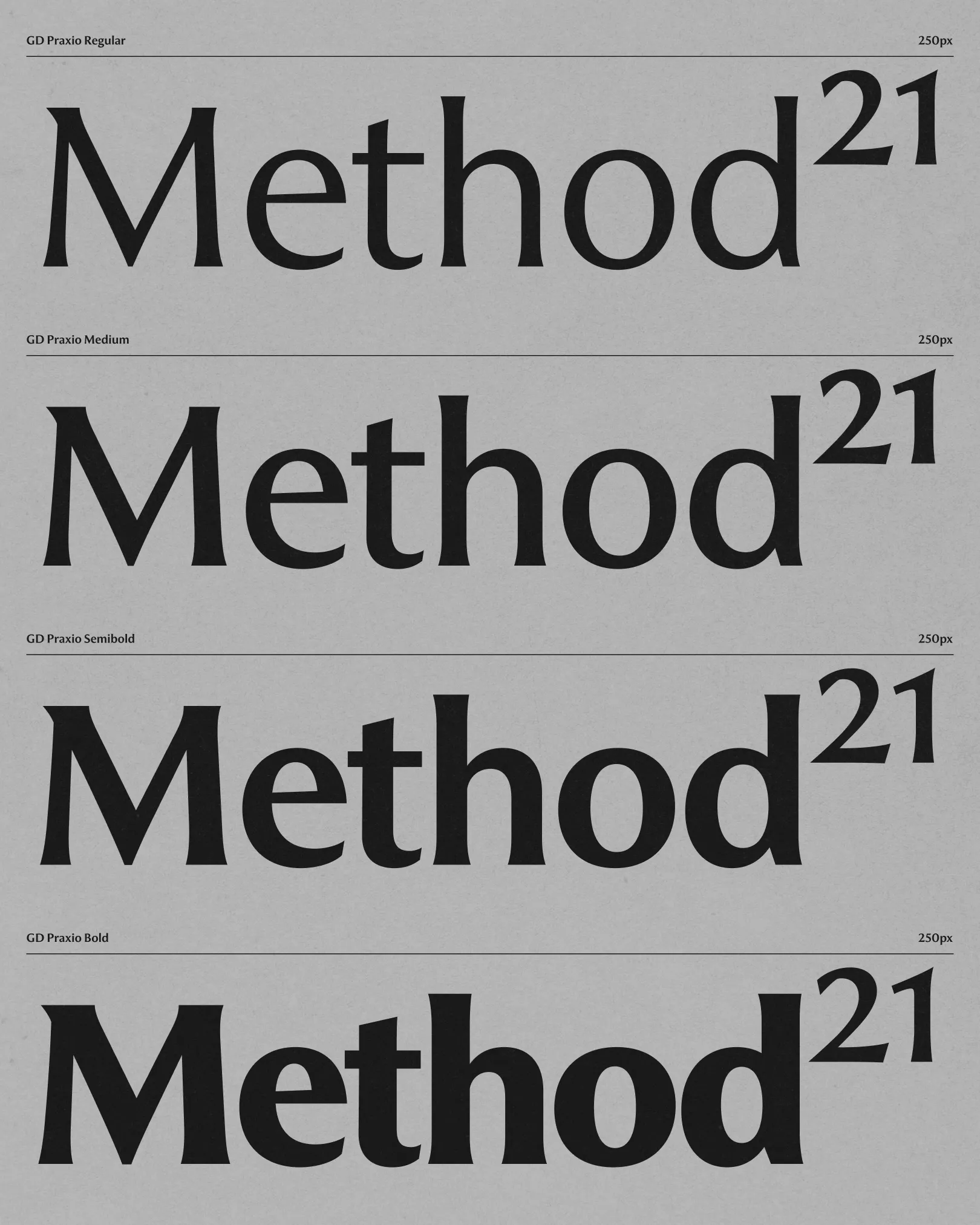
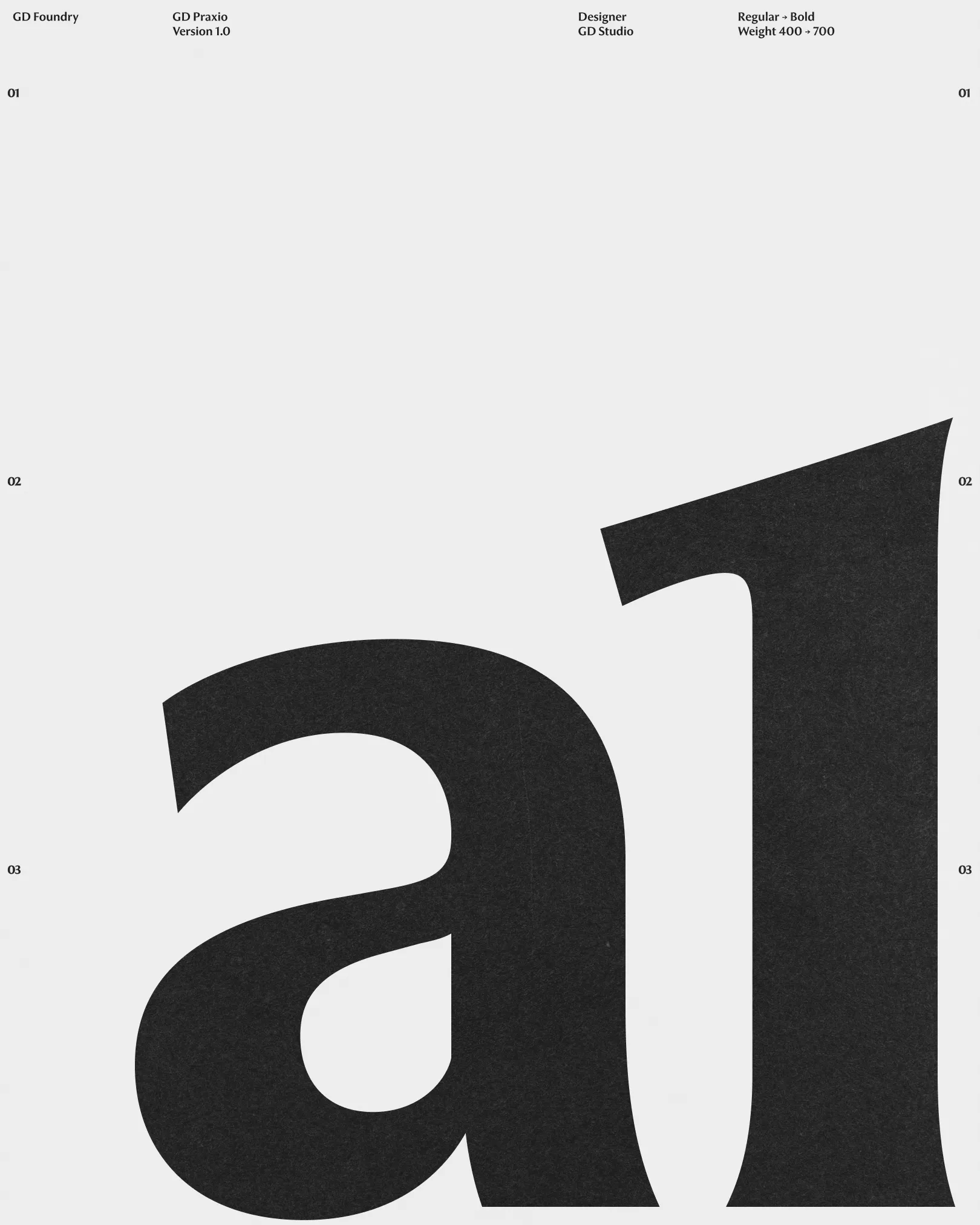
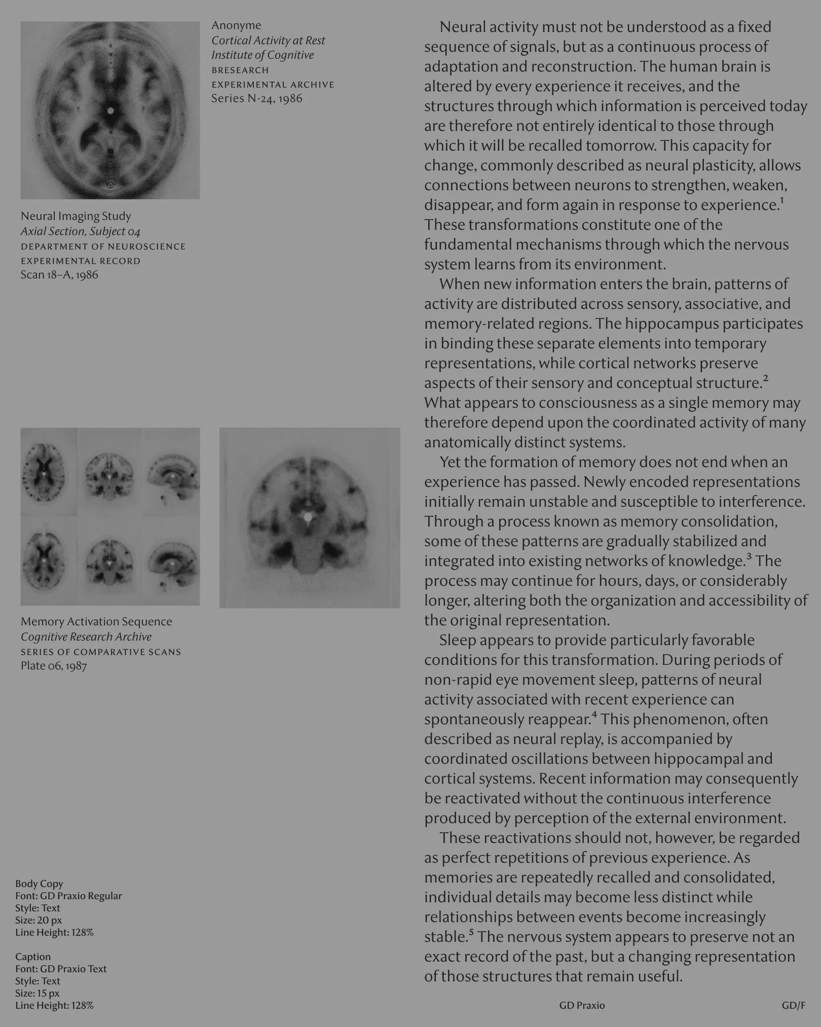
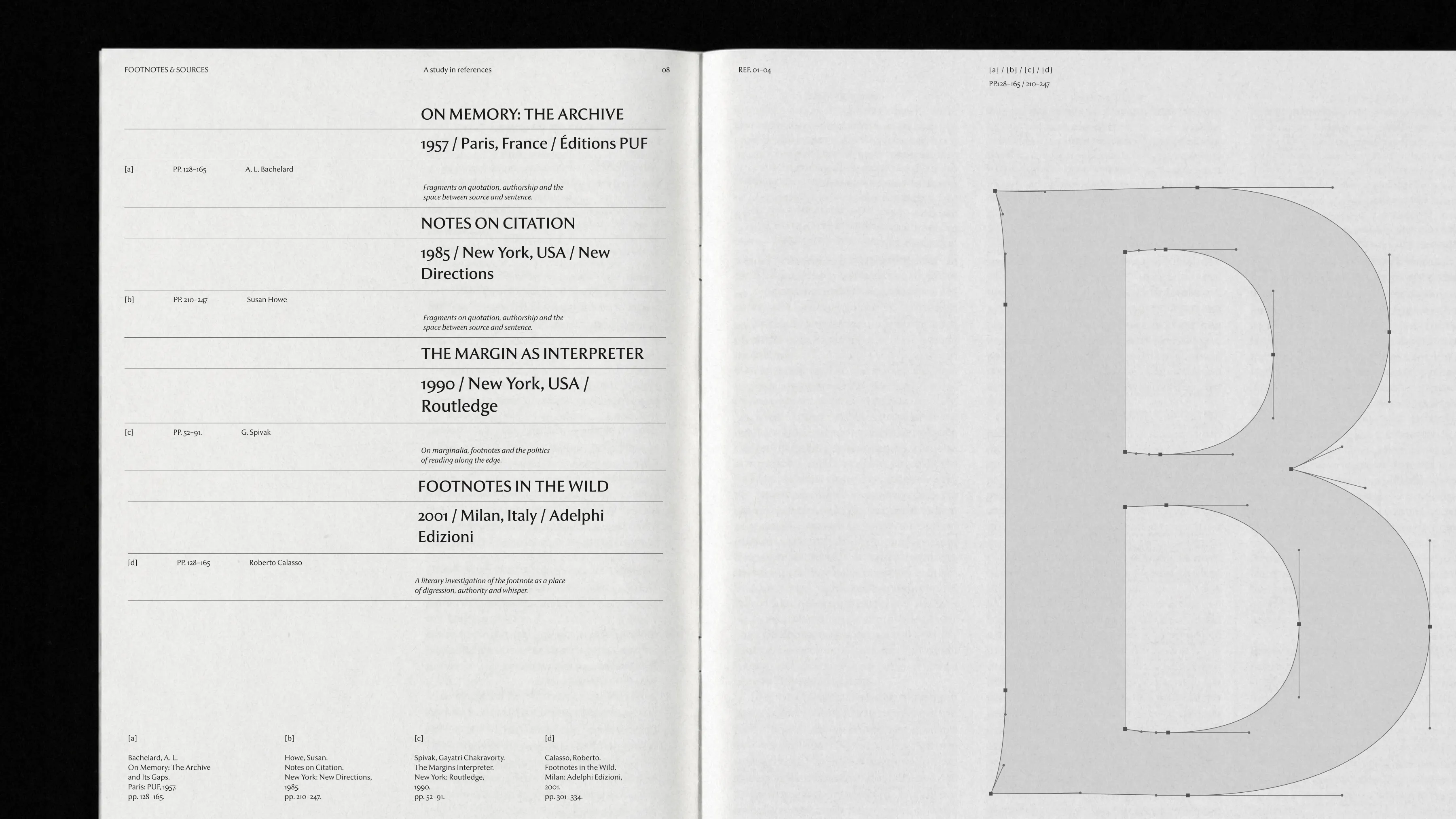
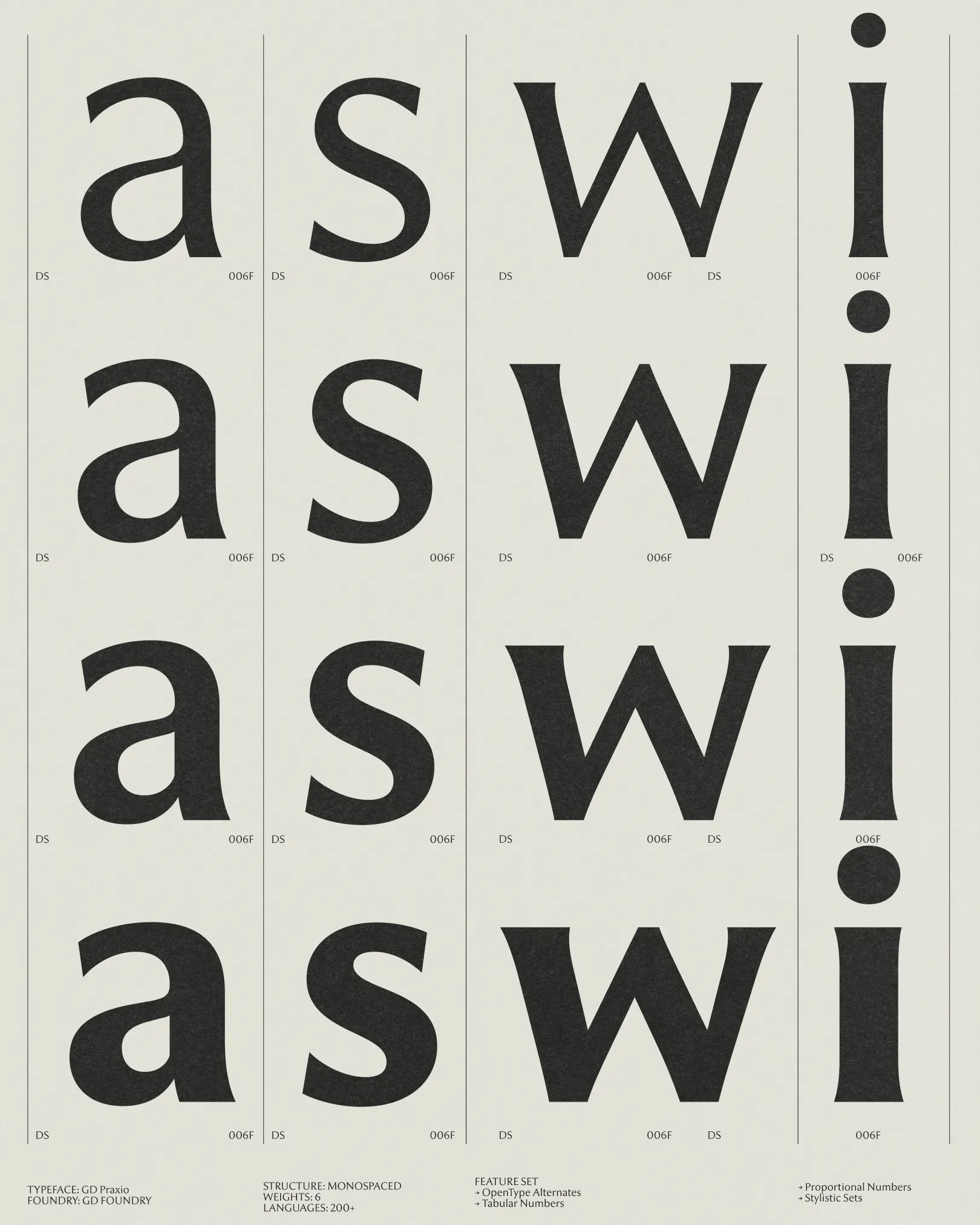
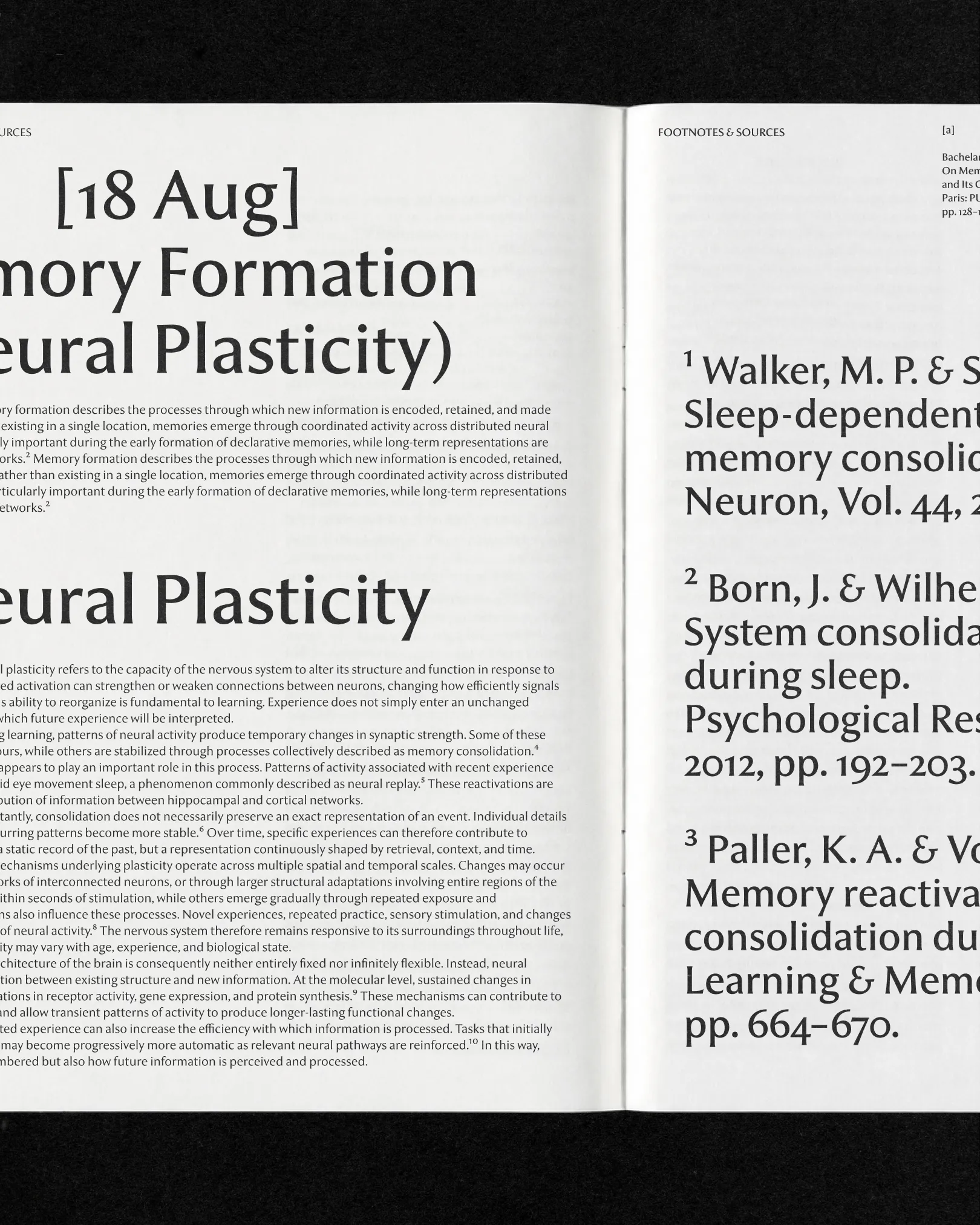
Rooted in the classical serifs of medical journals and refined into a humanist semi-serif, GD Praxio carries warmth, authority and credibility. Legible from long-form research to real-time chat — clinical, yet human. Built for the moments AI speaks about our bodies and our health.
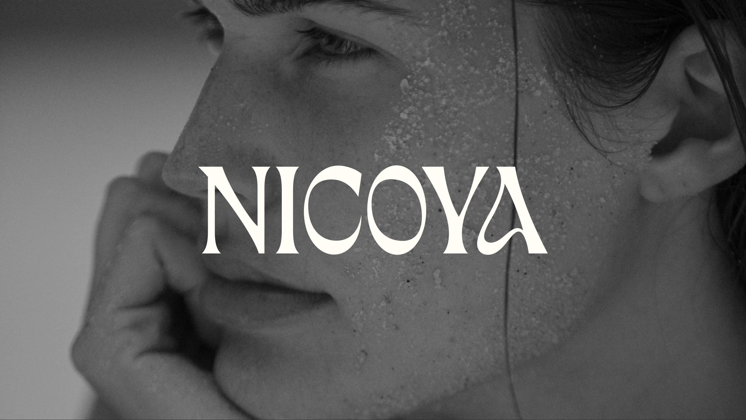
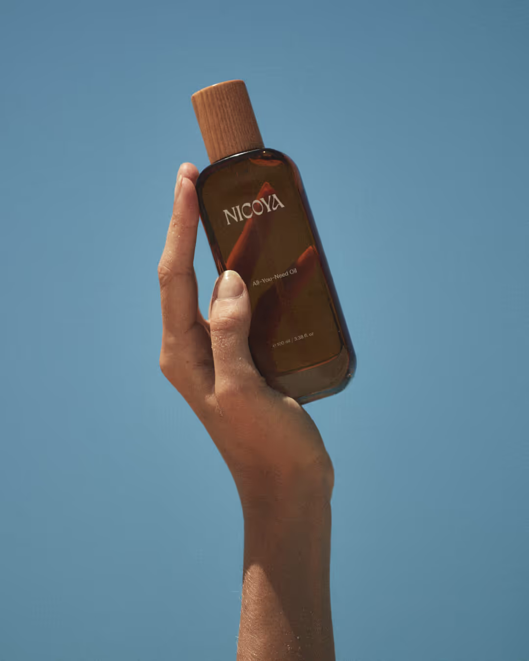
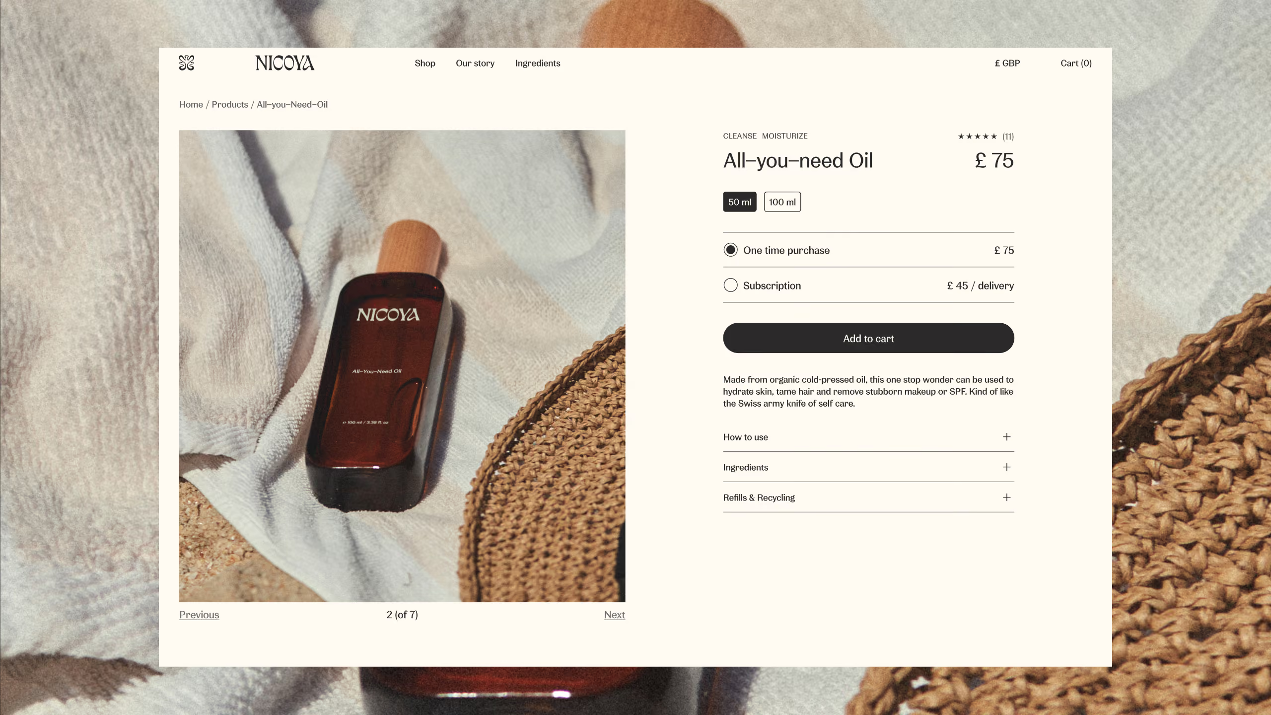
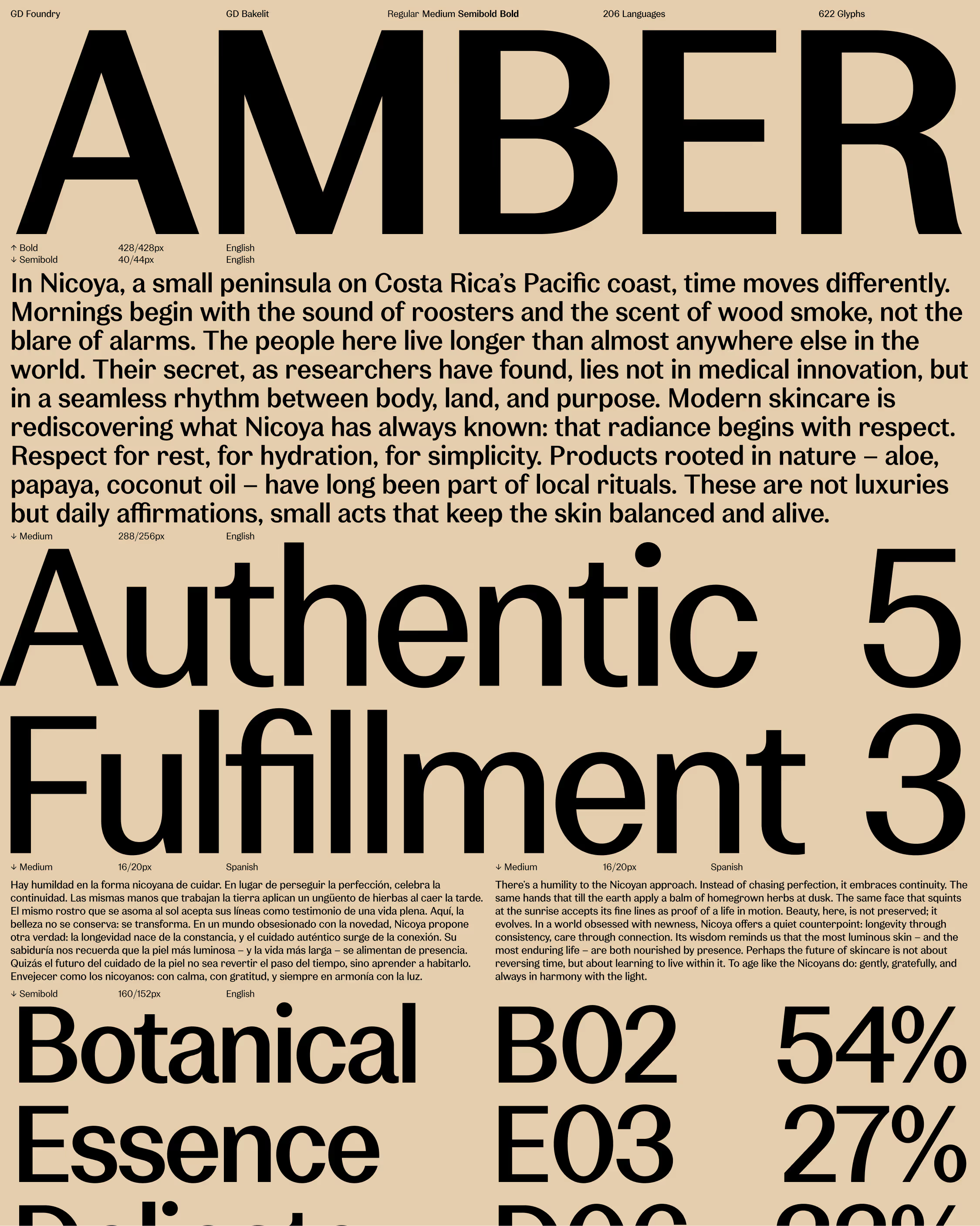
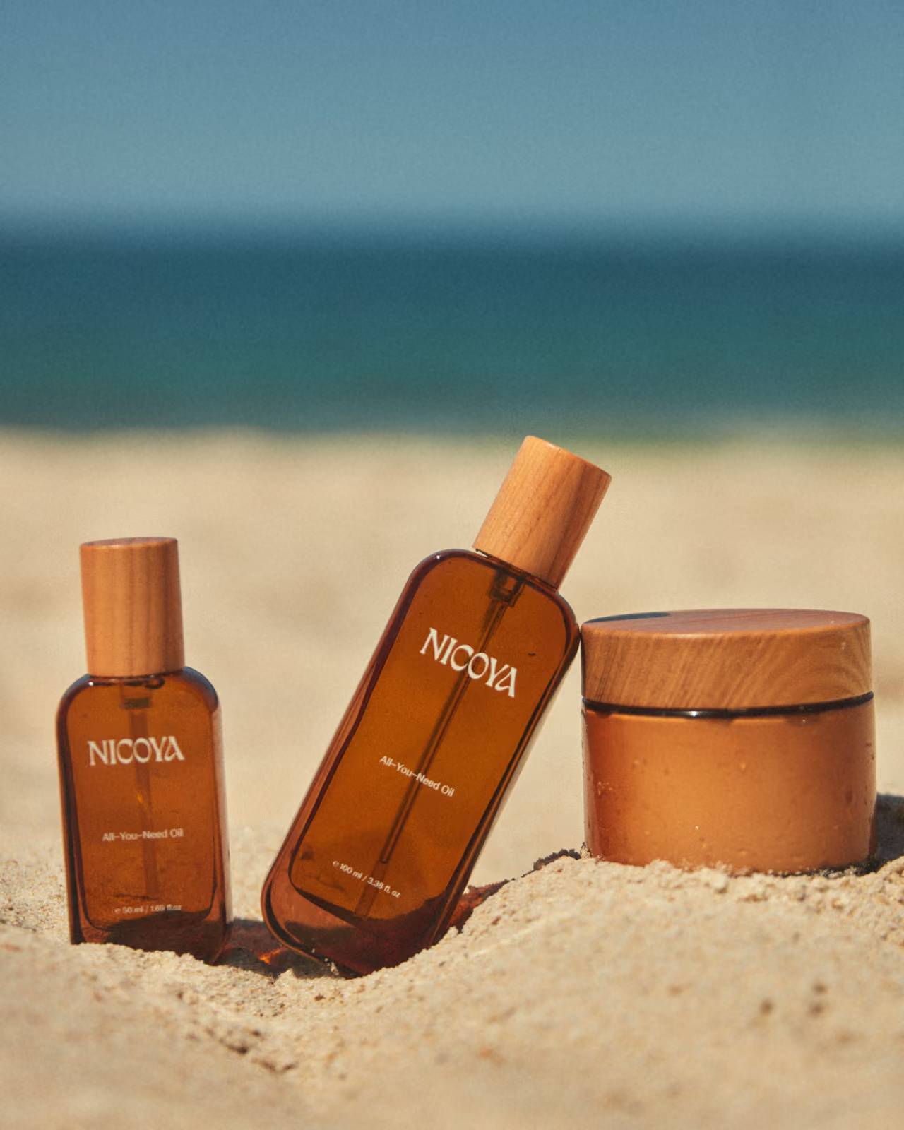
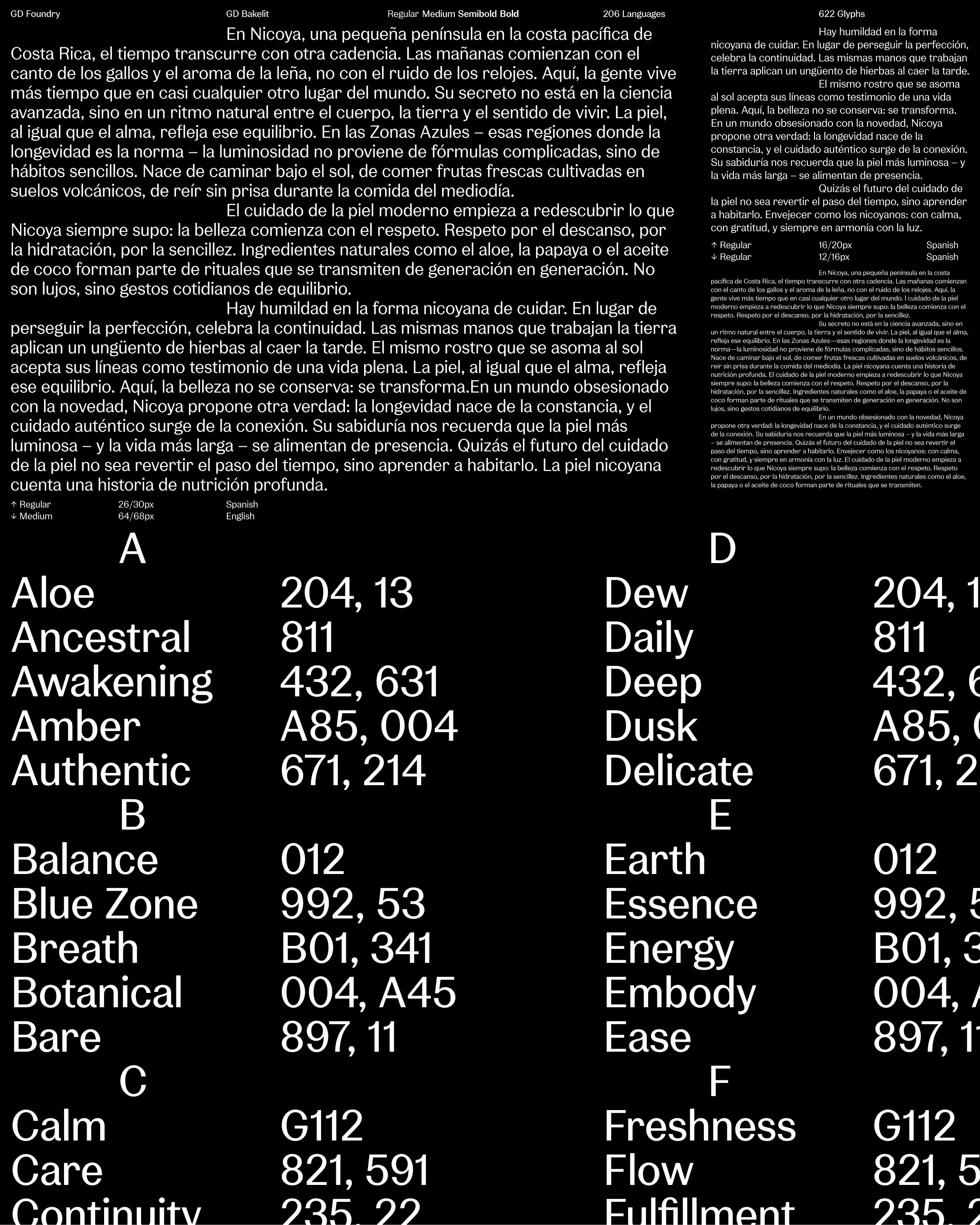
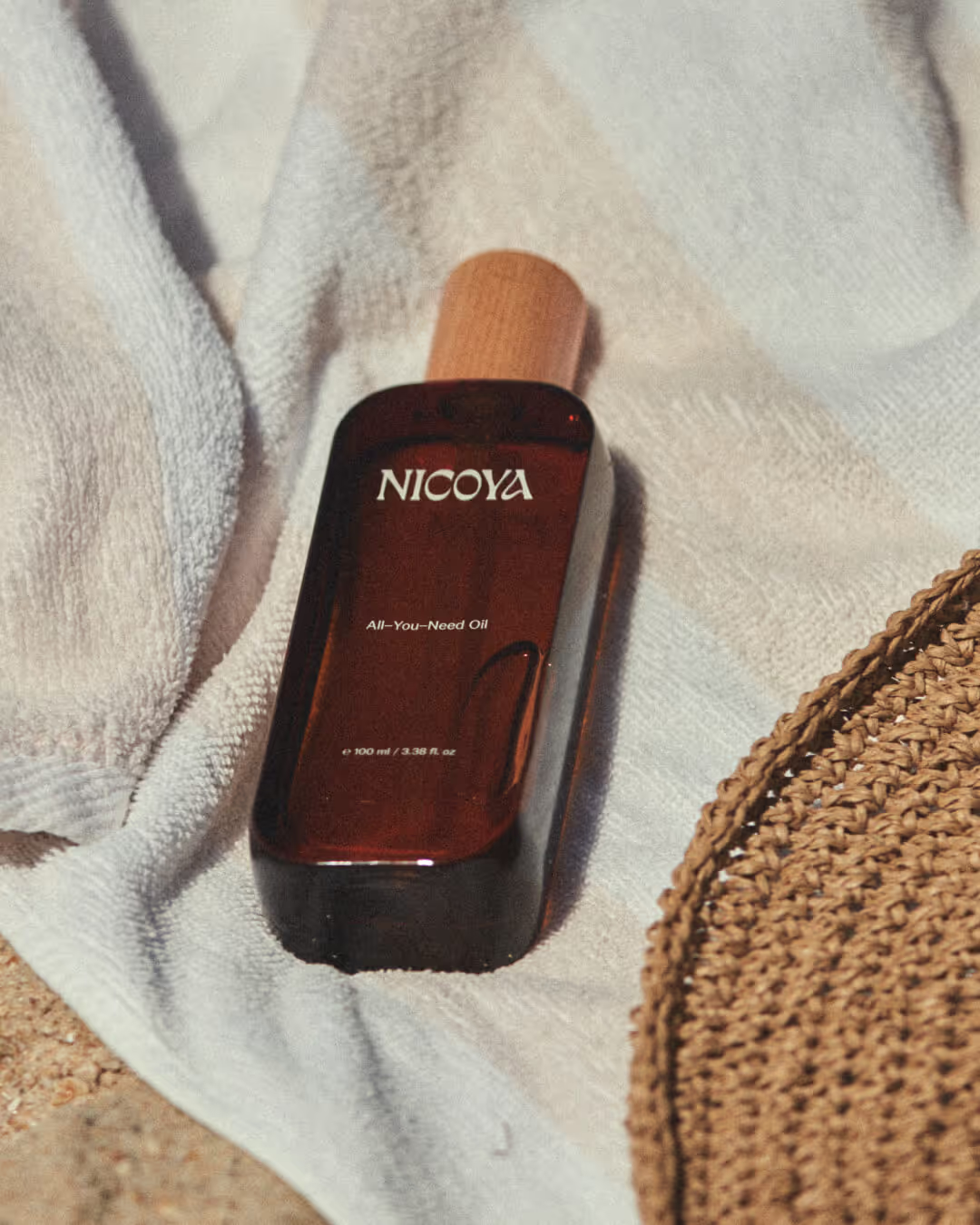
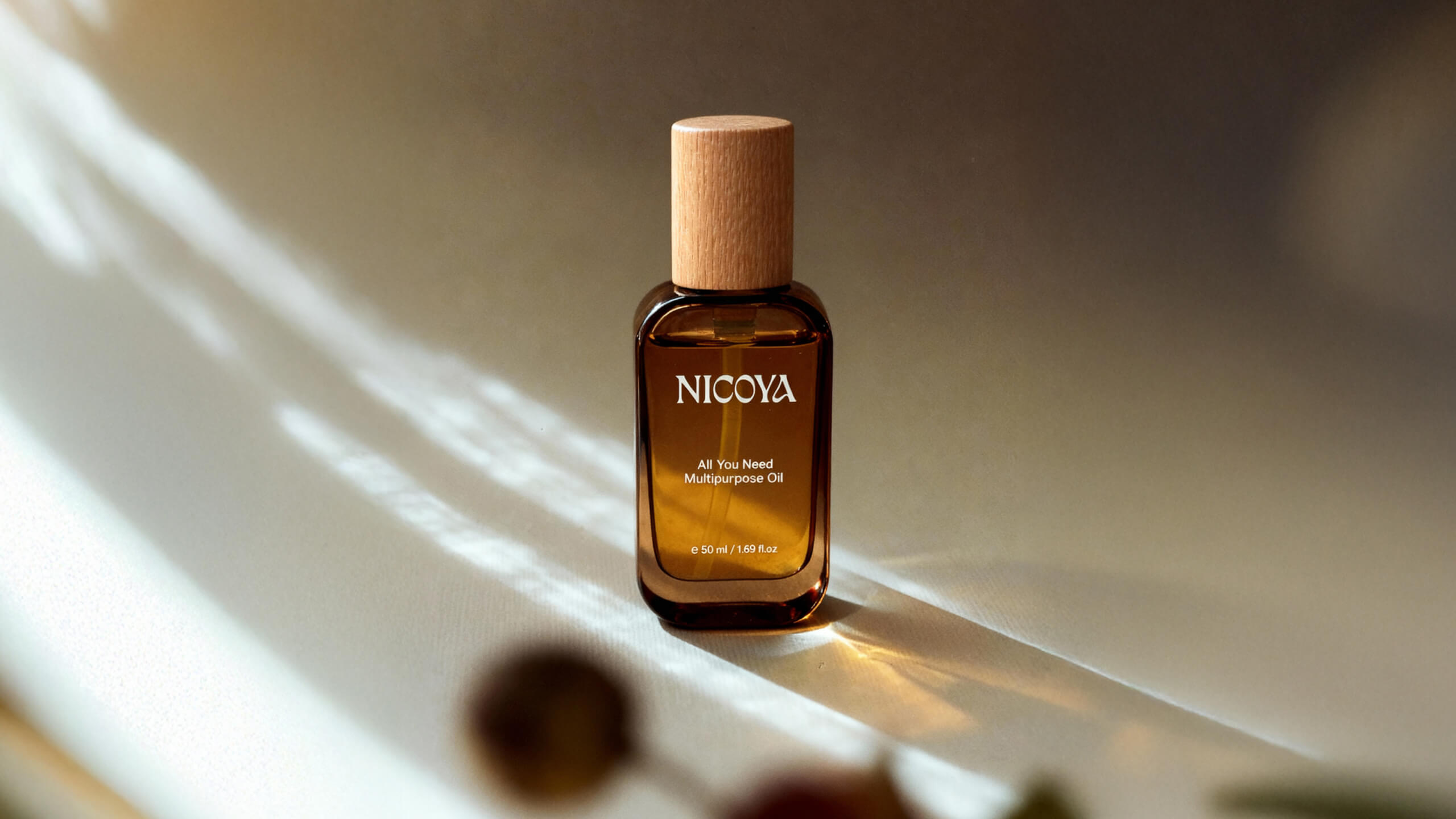
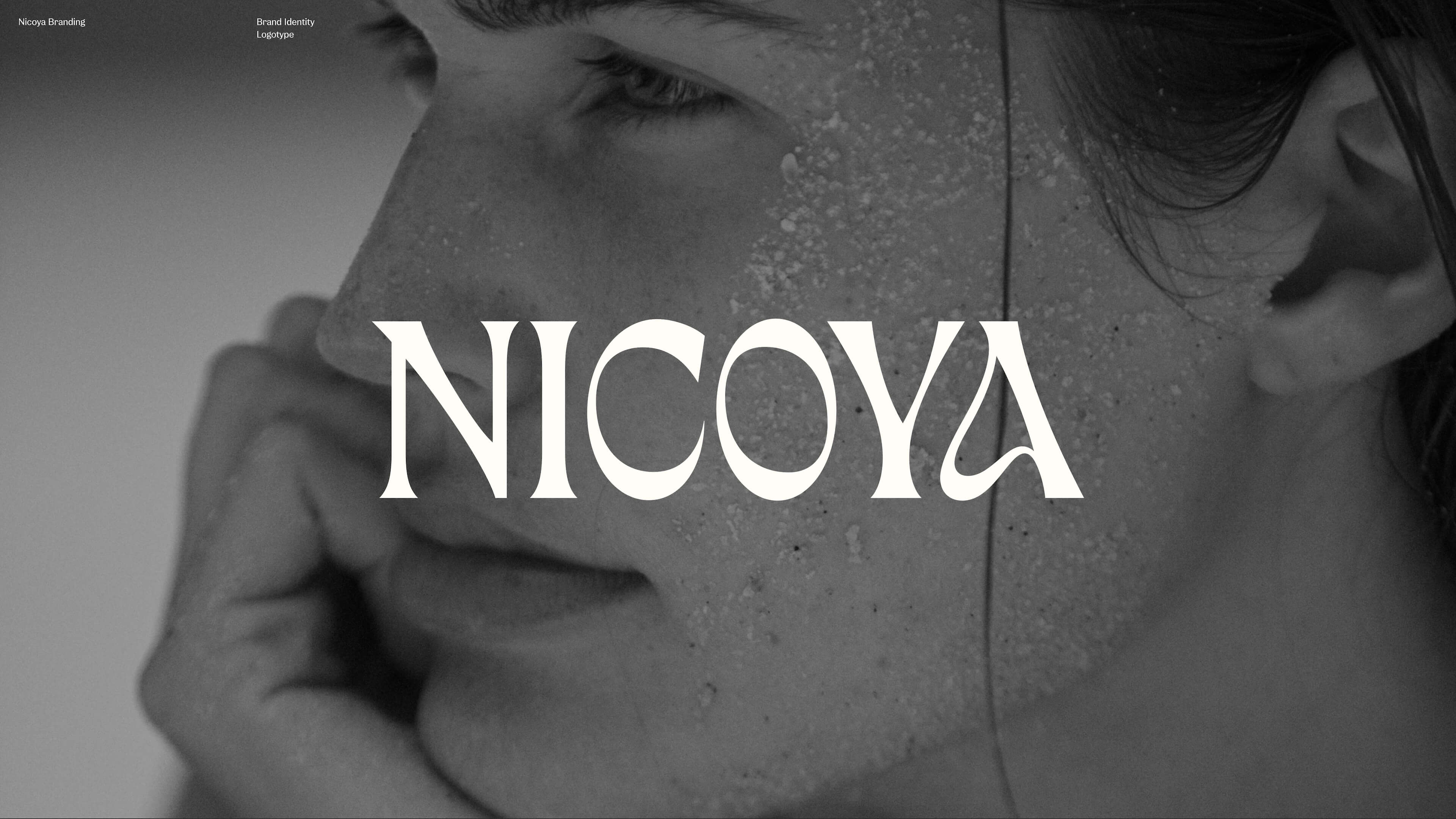
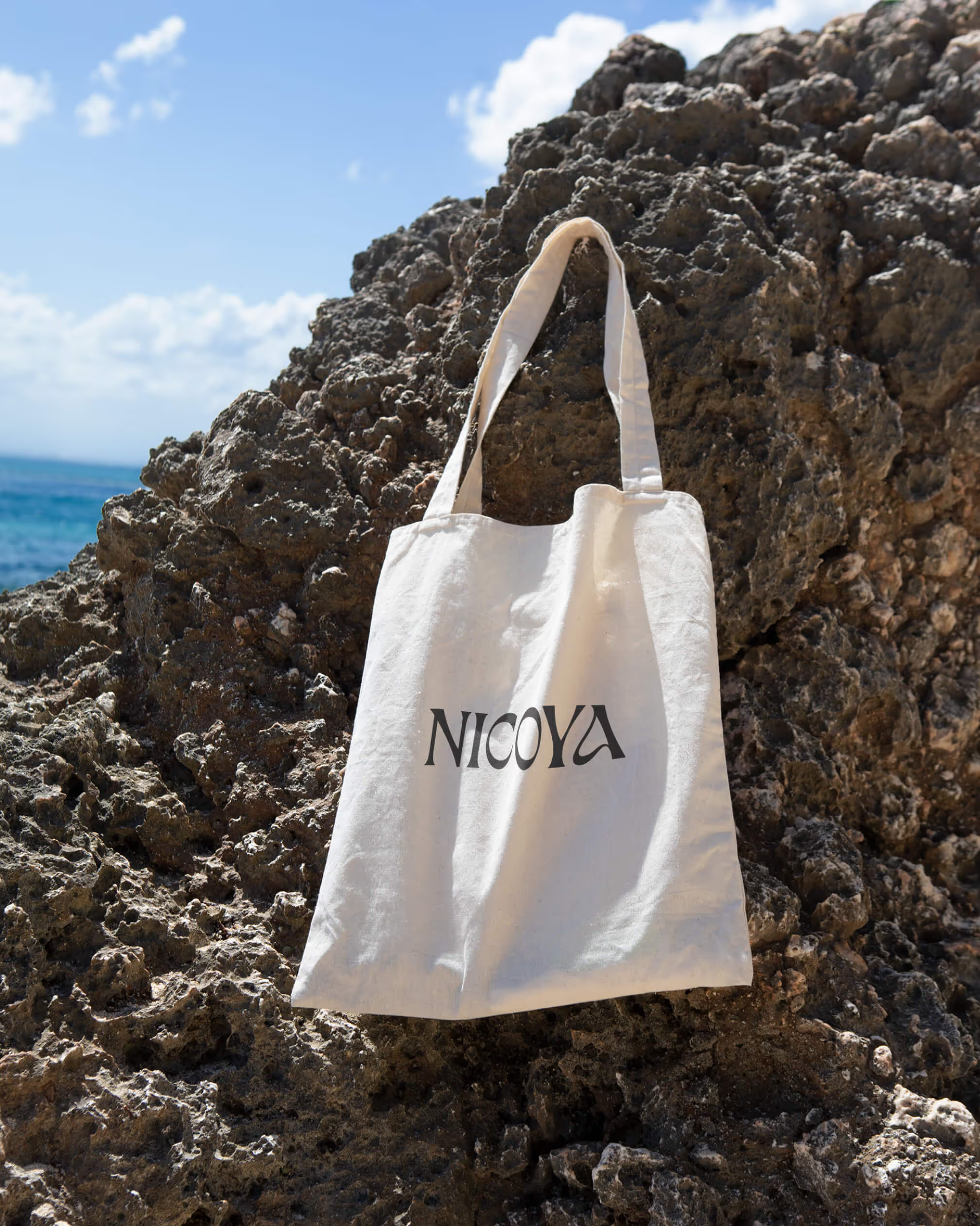
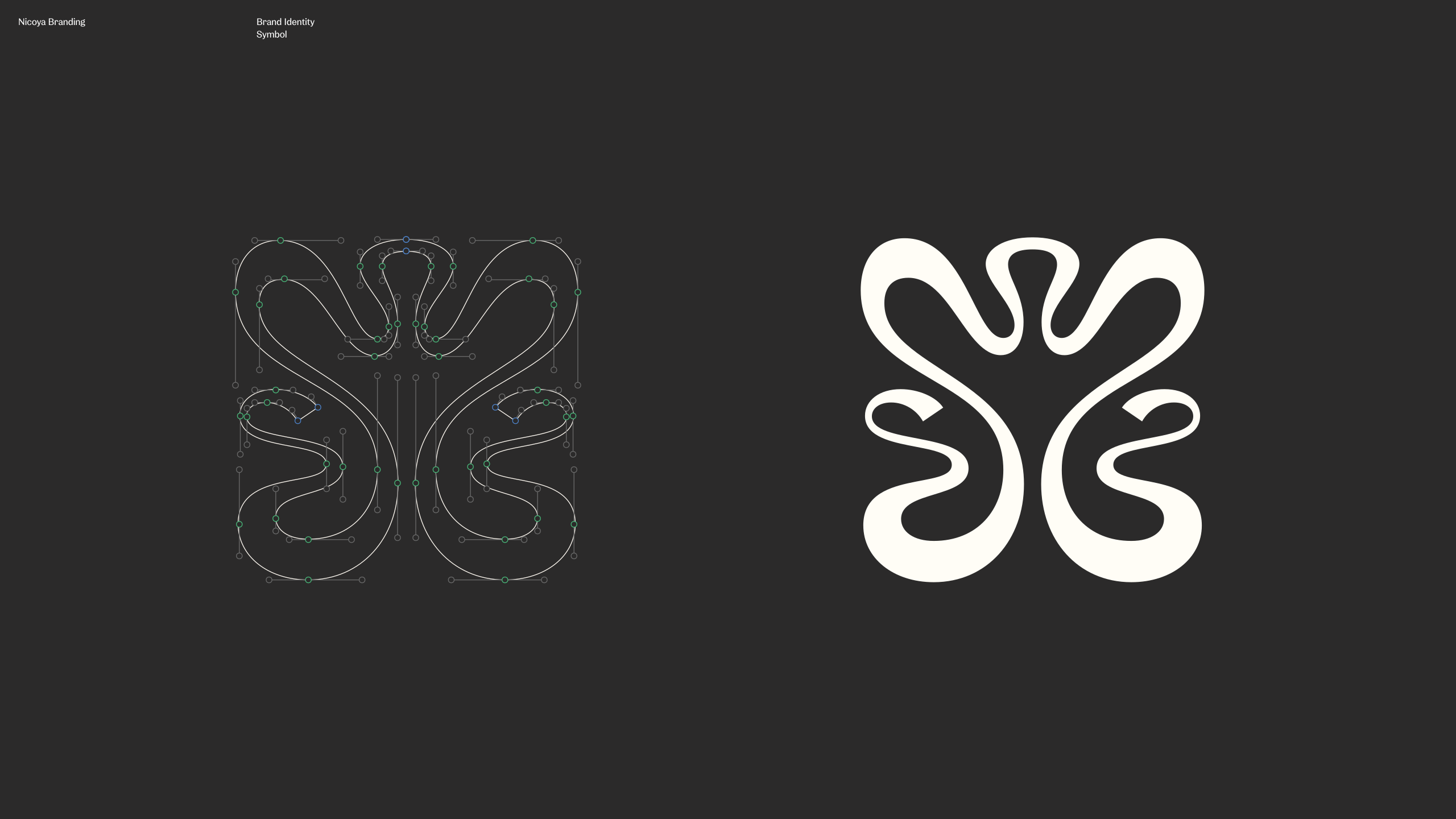
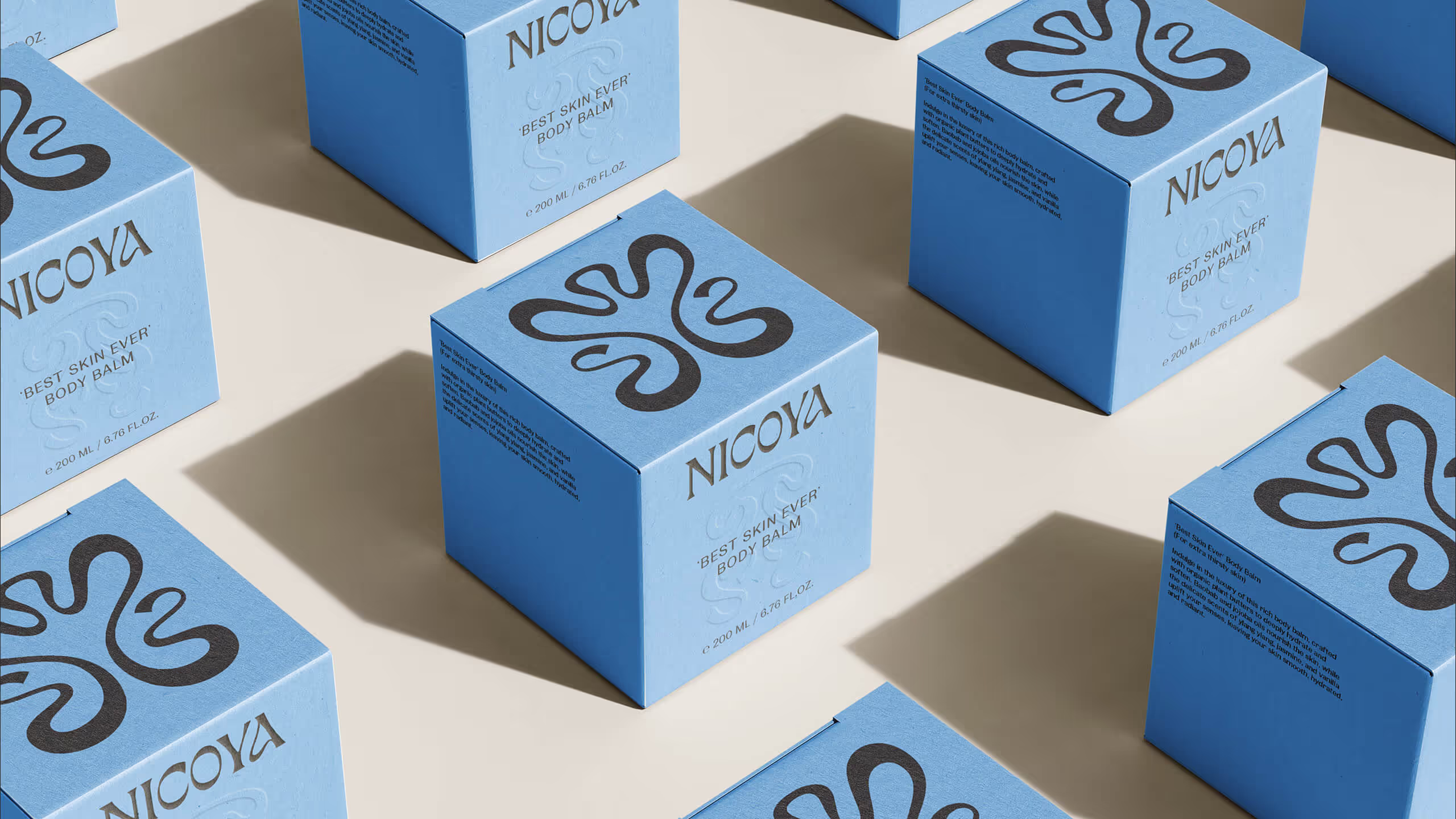
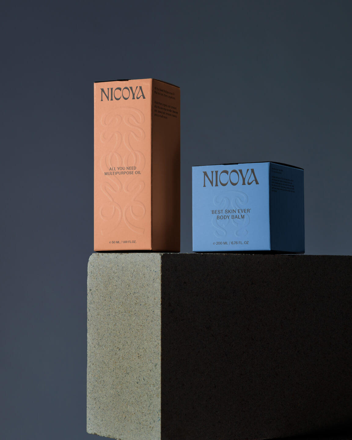
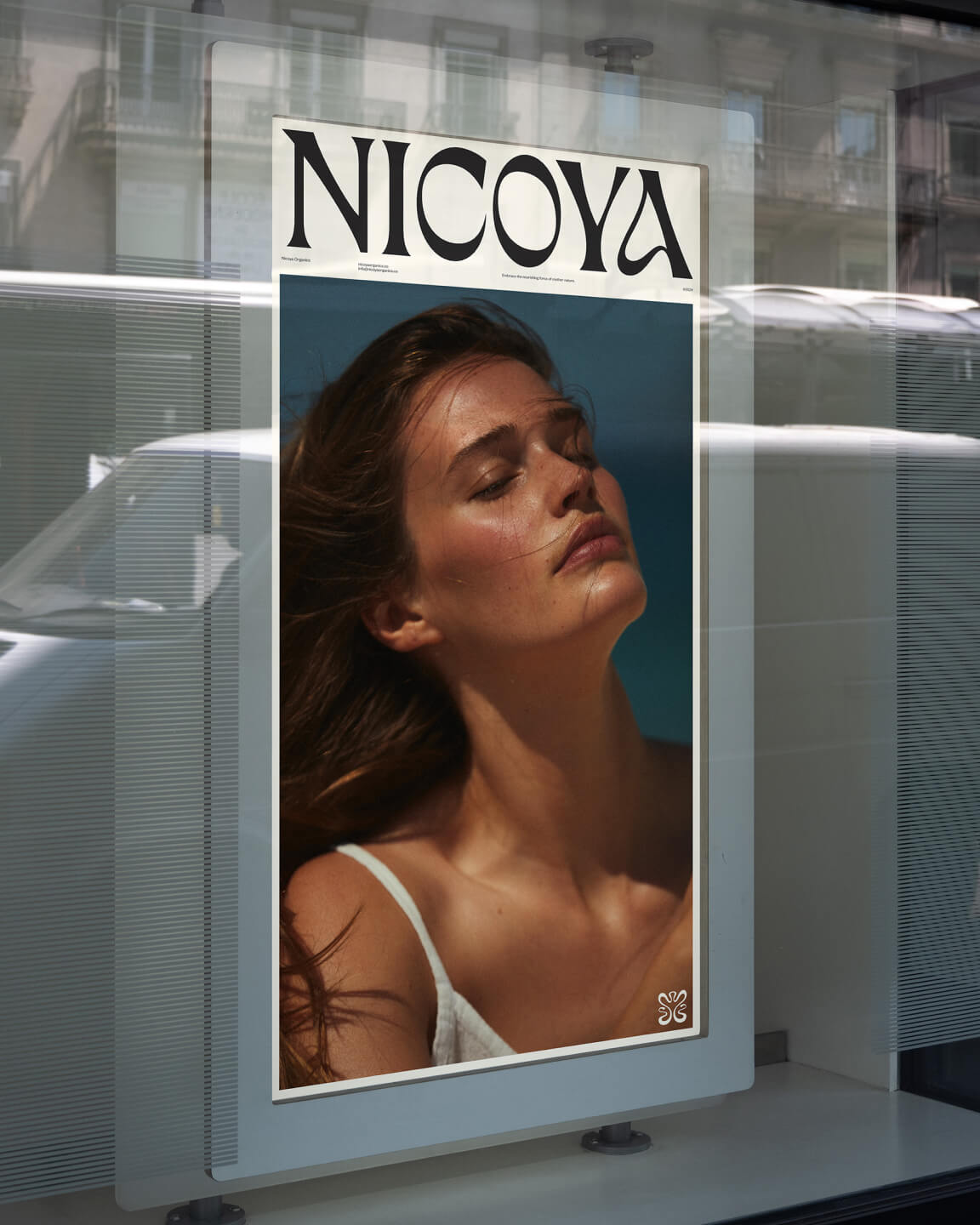
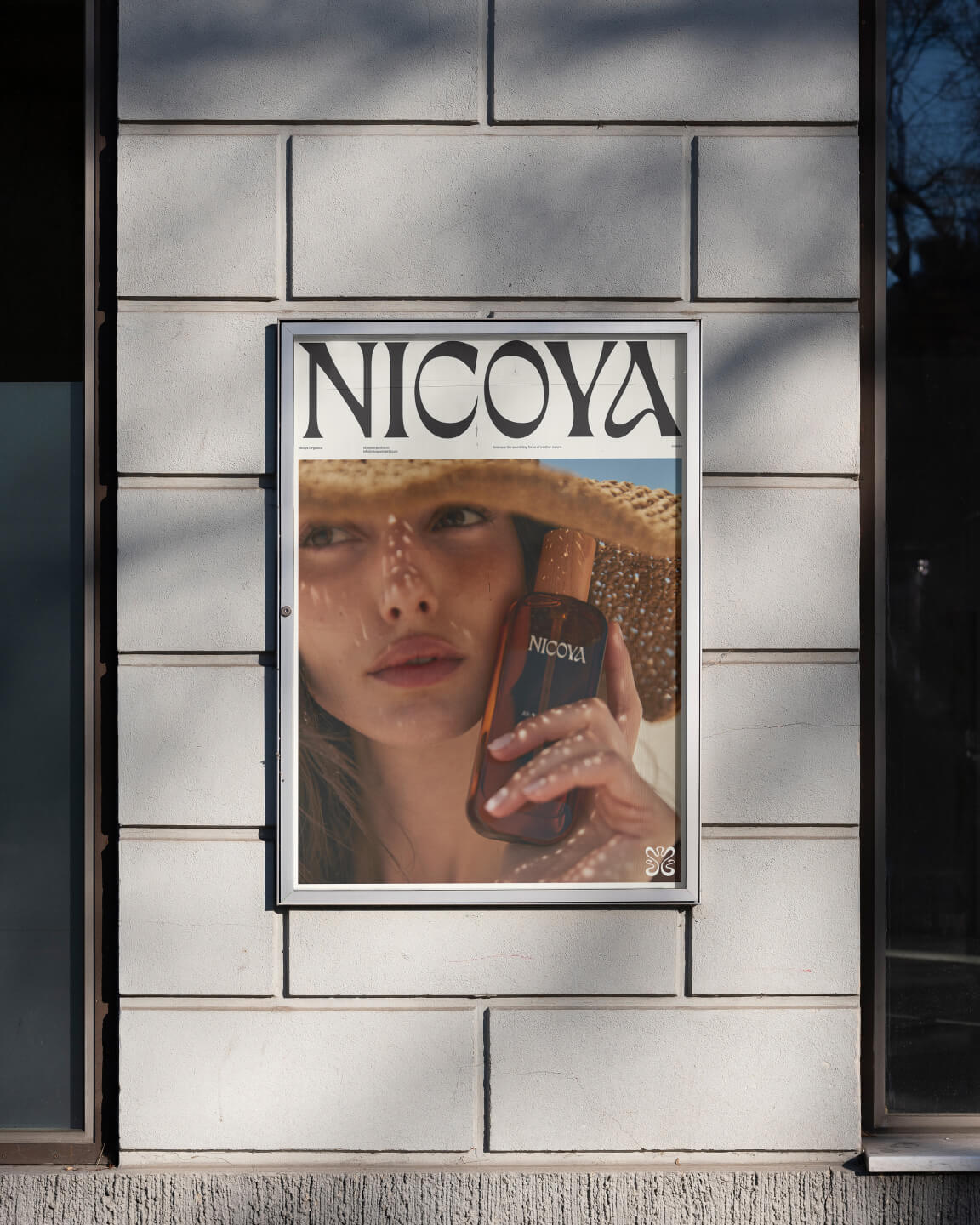
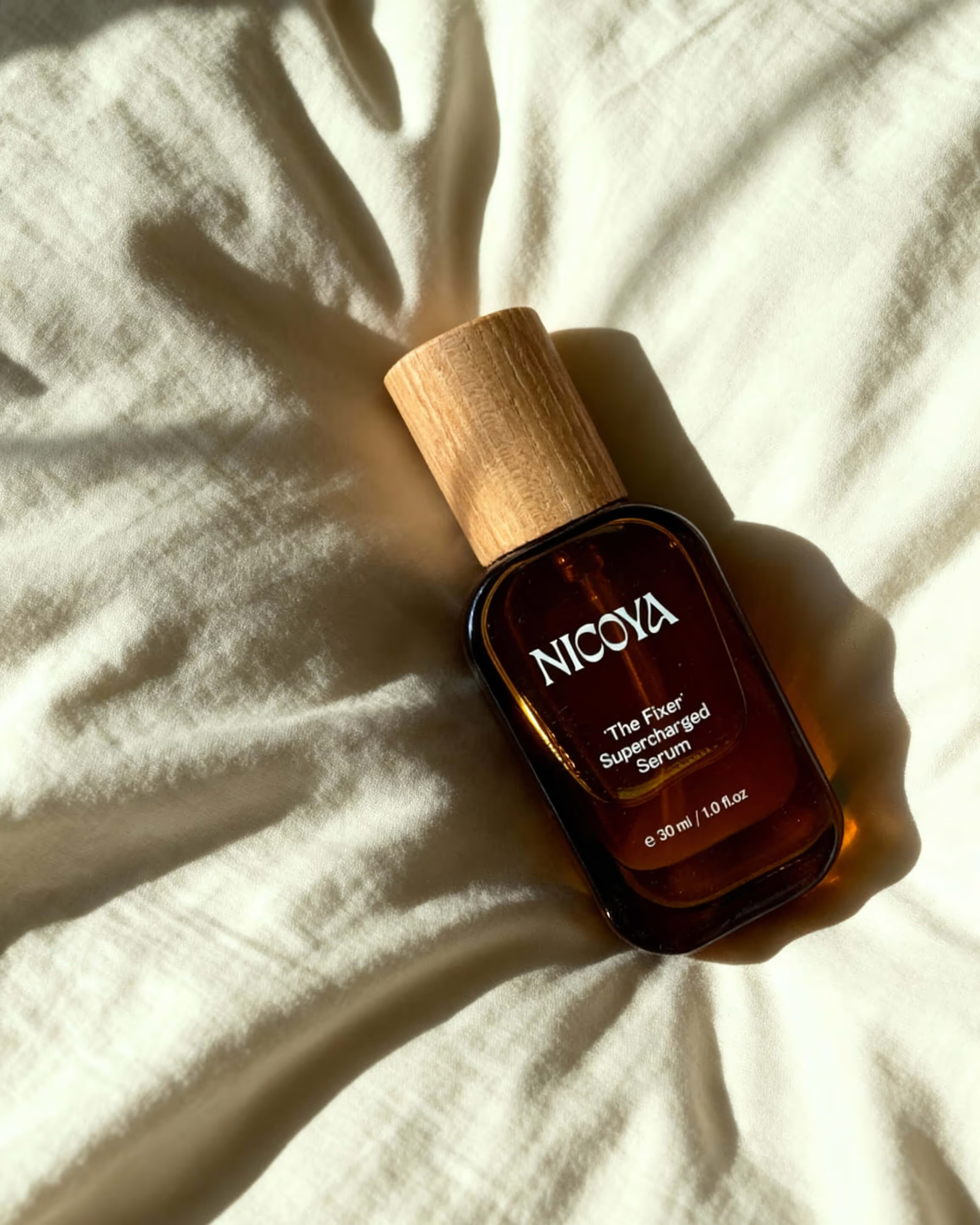
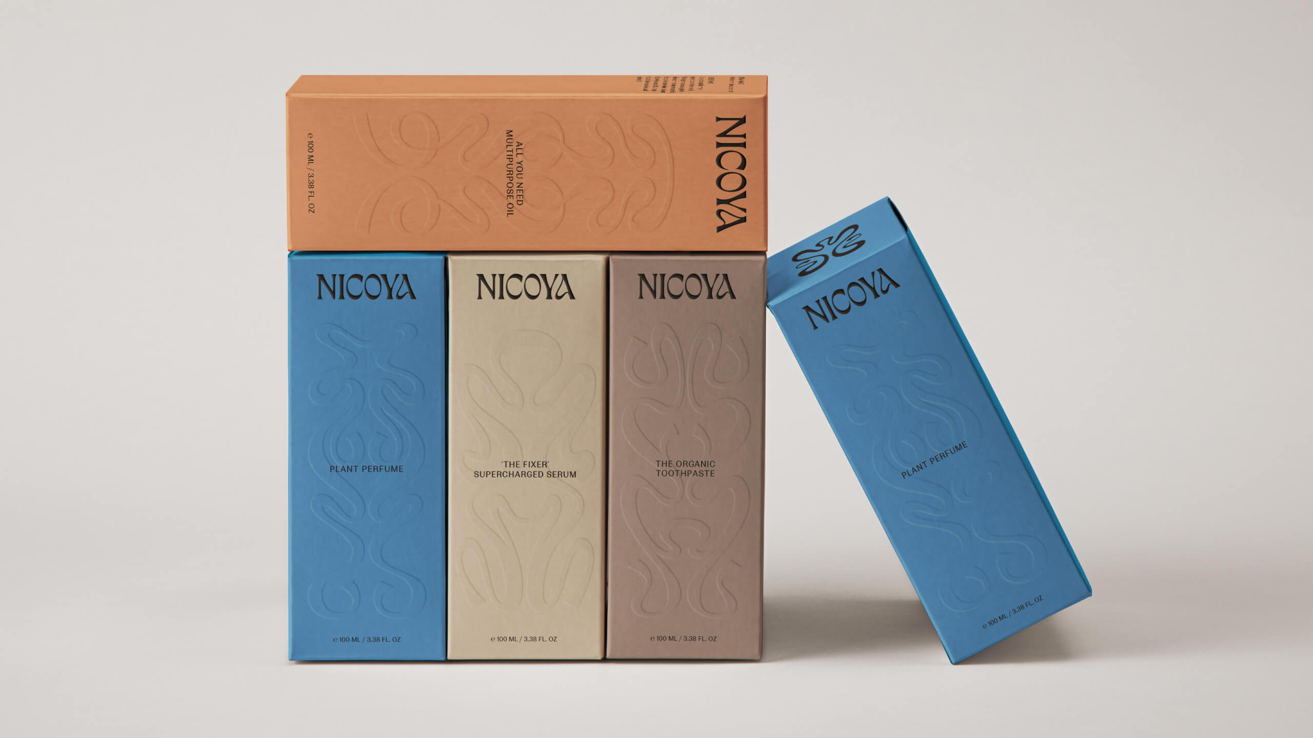
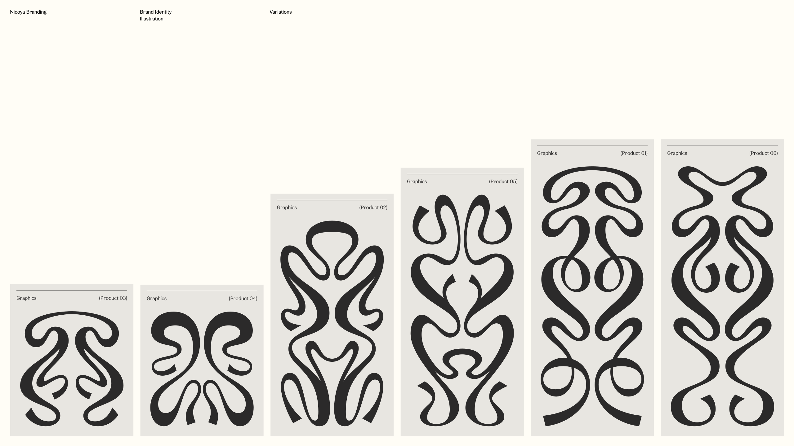
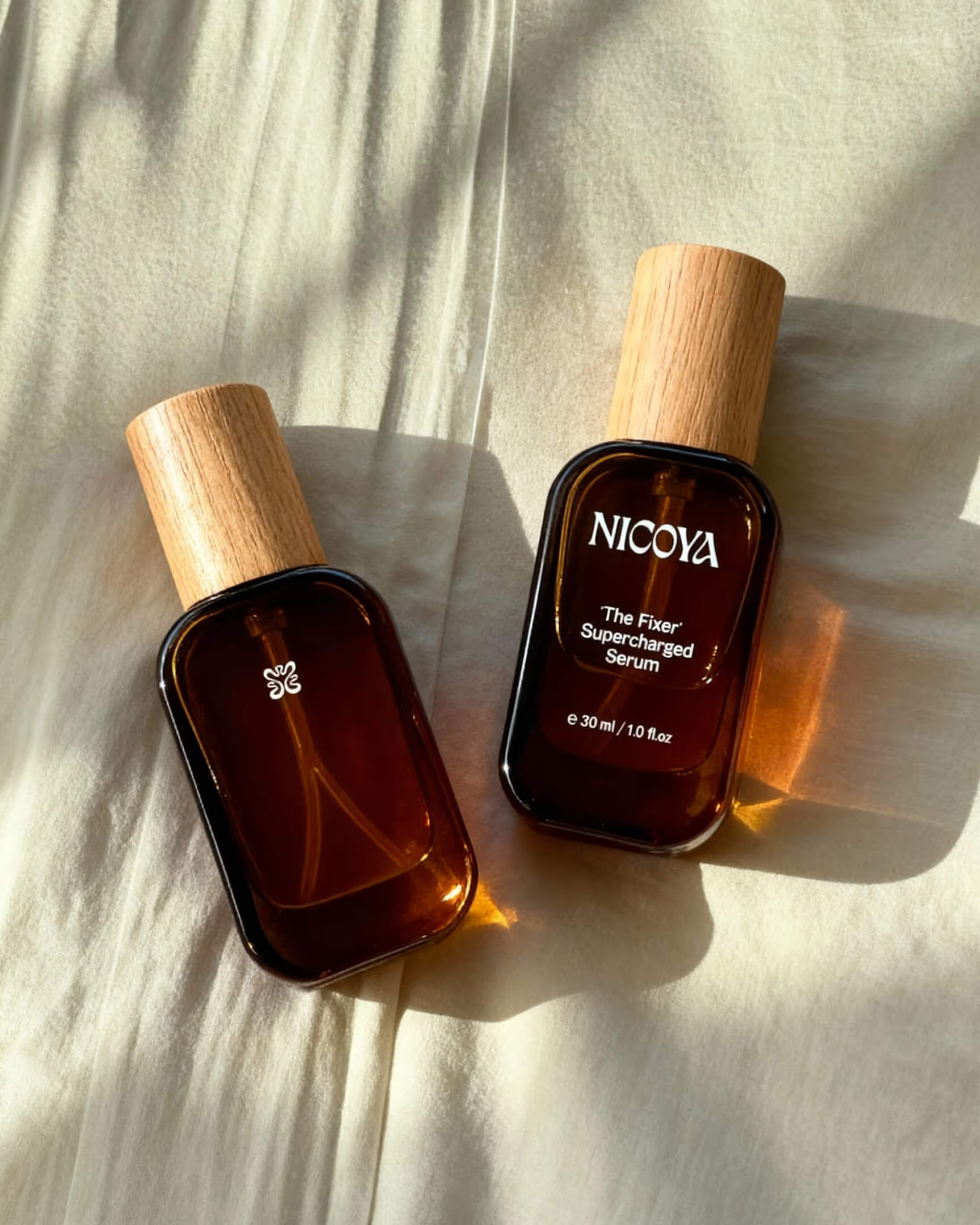
Inspired by the organic curves of Art Nouveau — gentle, natural and timeless. Softness balanced with distinct character, reflecting Nicoya's focus on purity, vitality and balance.
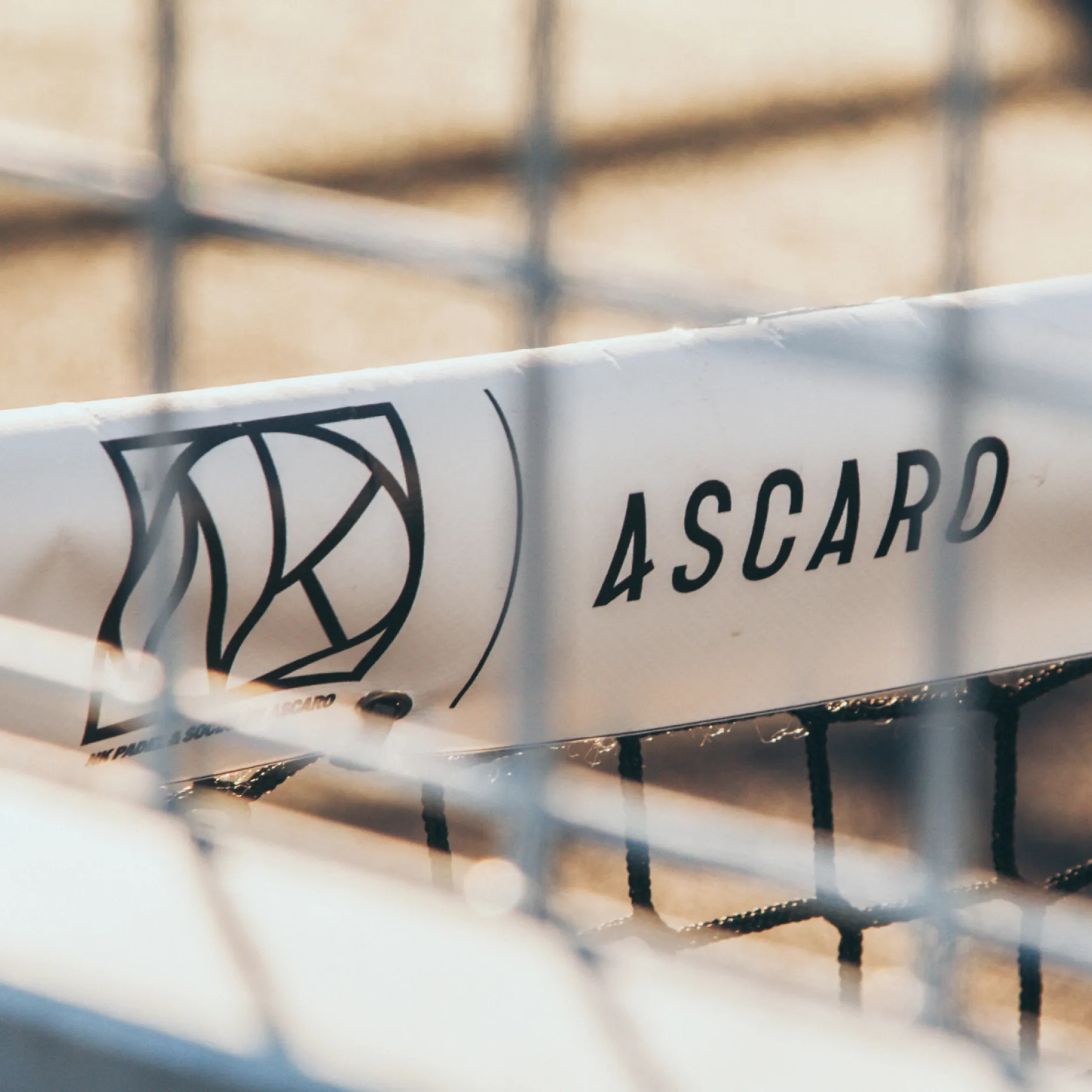
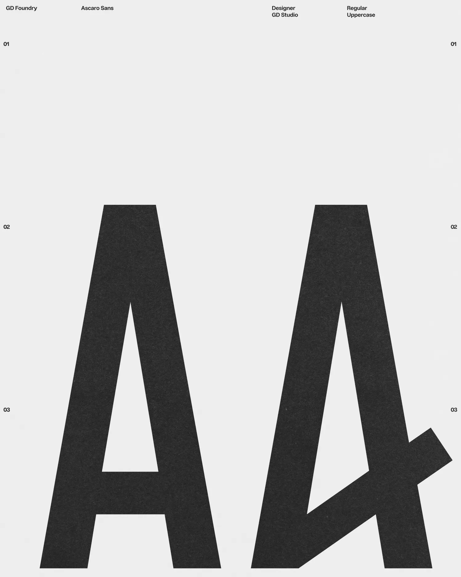
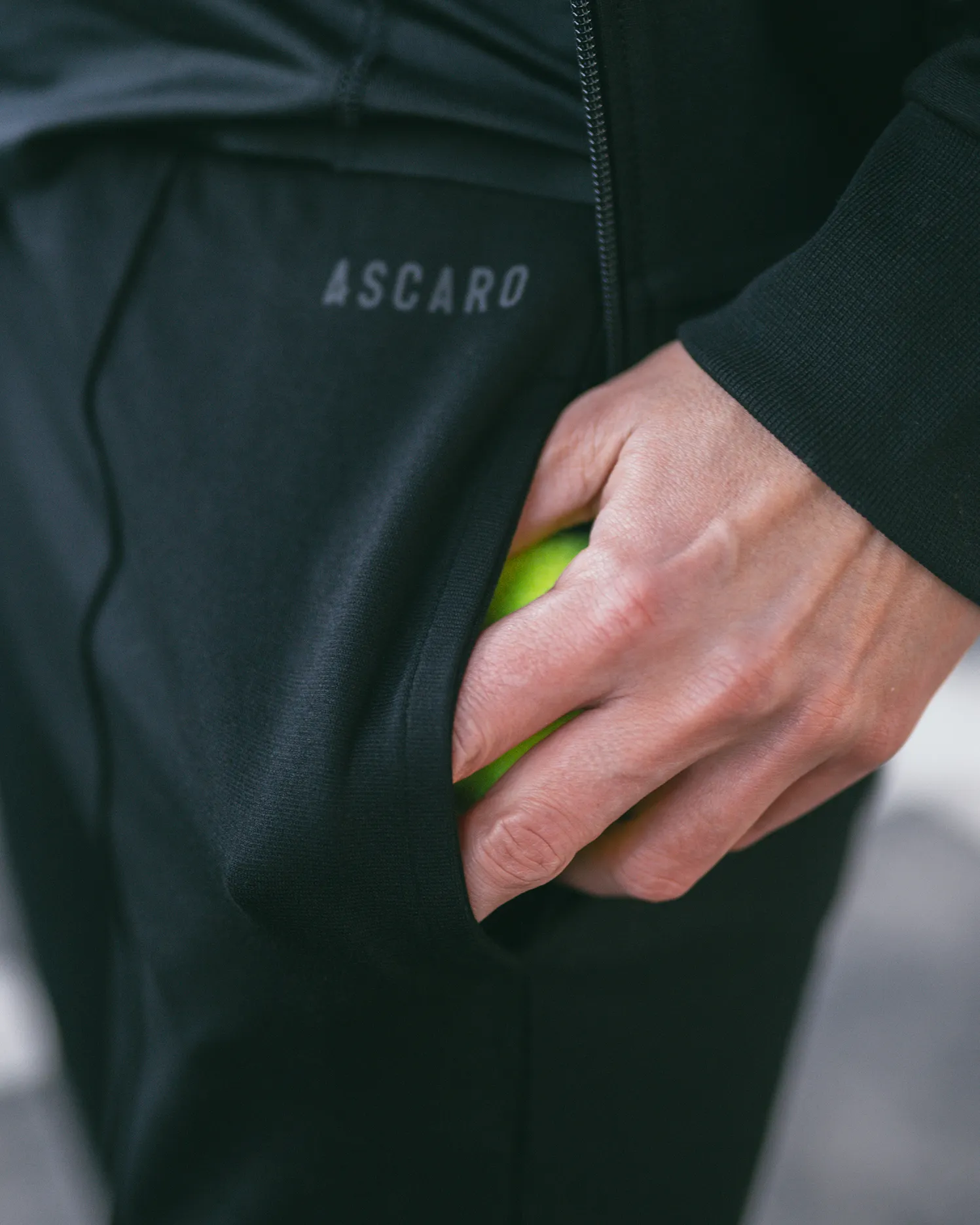
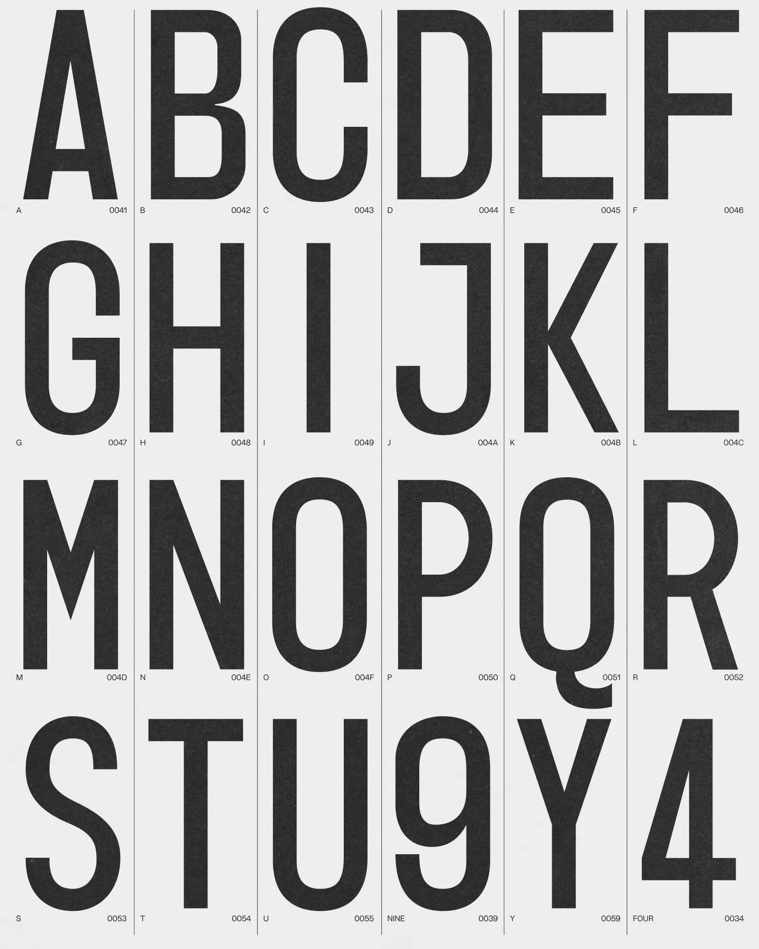
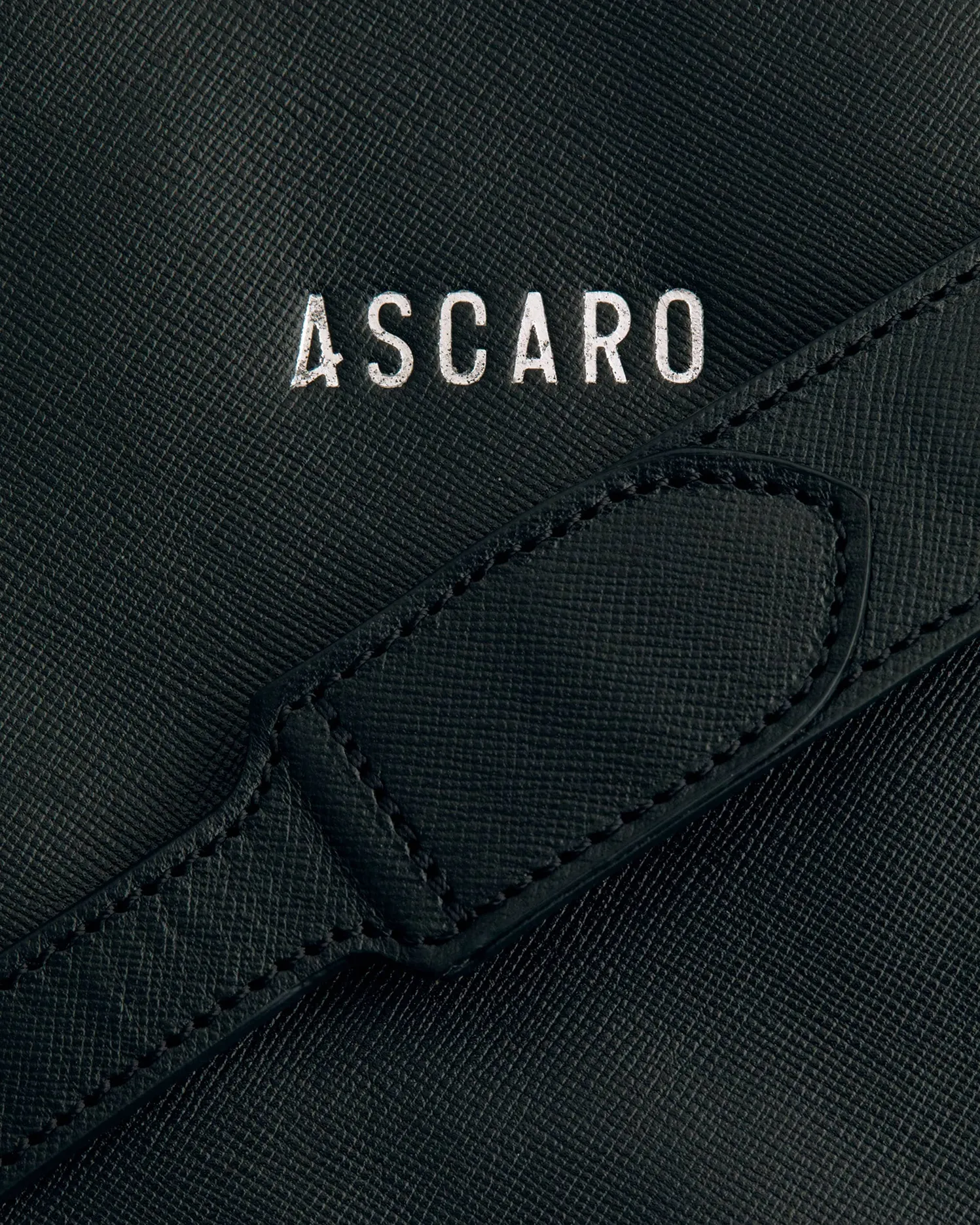
A padel court is twenty by ten metres — a double square. Ascaro Sans is drawn from it: every cap height, counter and stroke governed by the court's geometry. Uppercase only, engineered like scoreboard signage. One letter breaks the system: the A, its leg kicking outward like the ball off the glass.
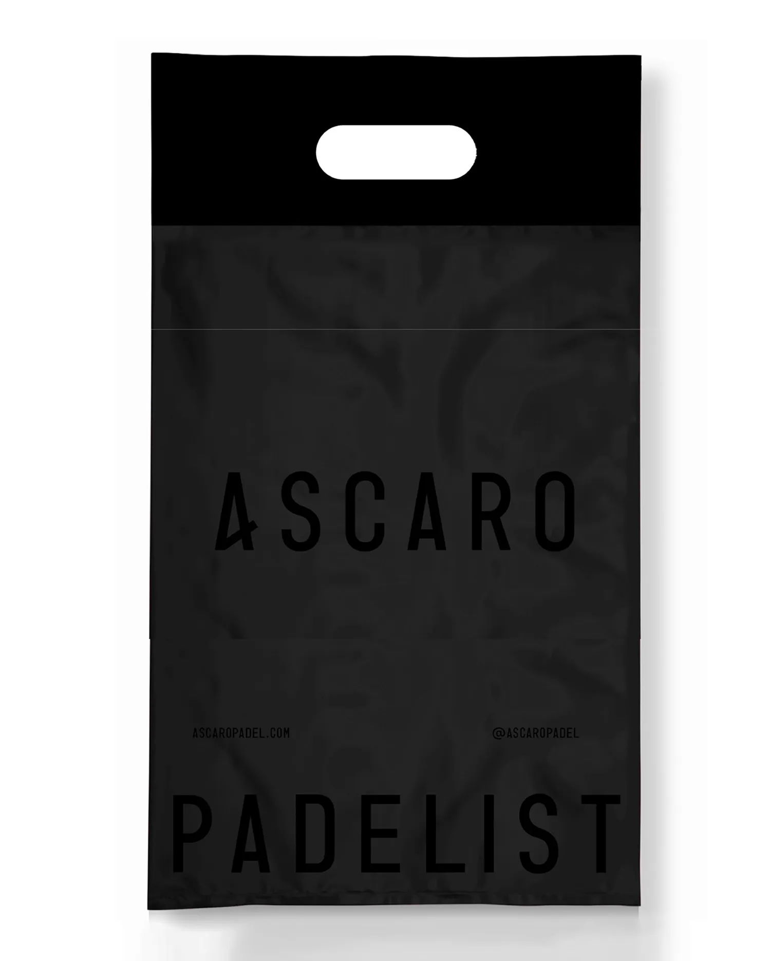
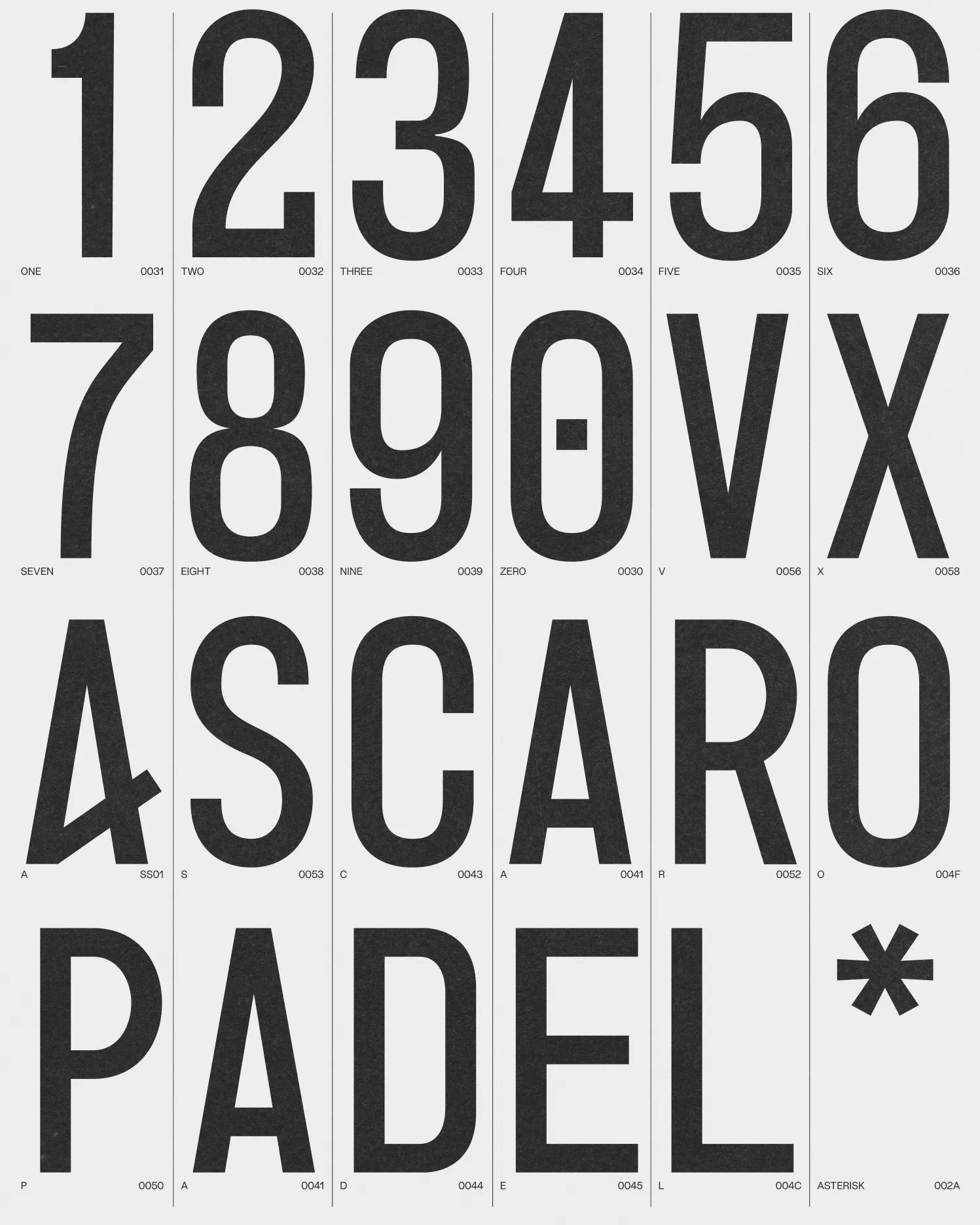
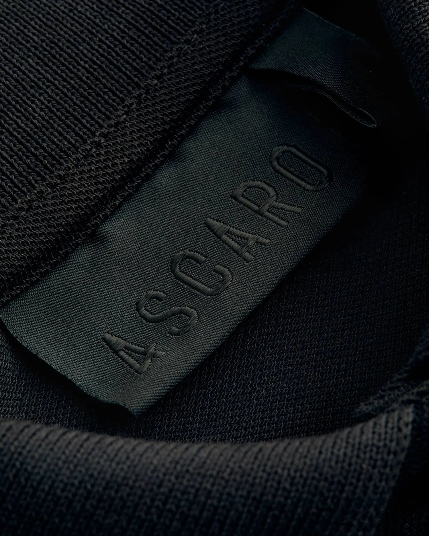
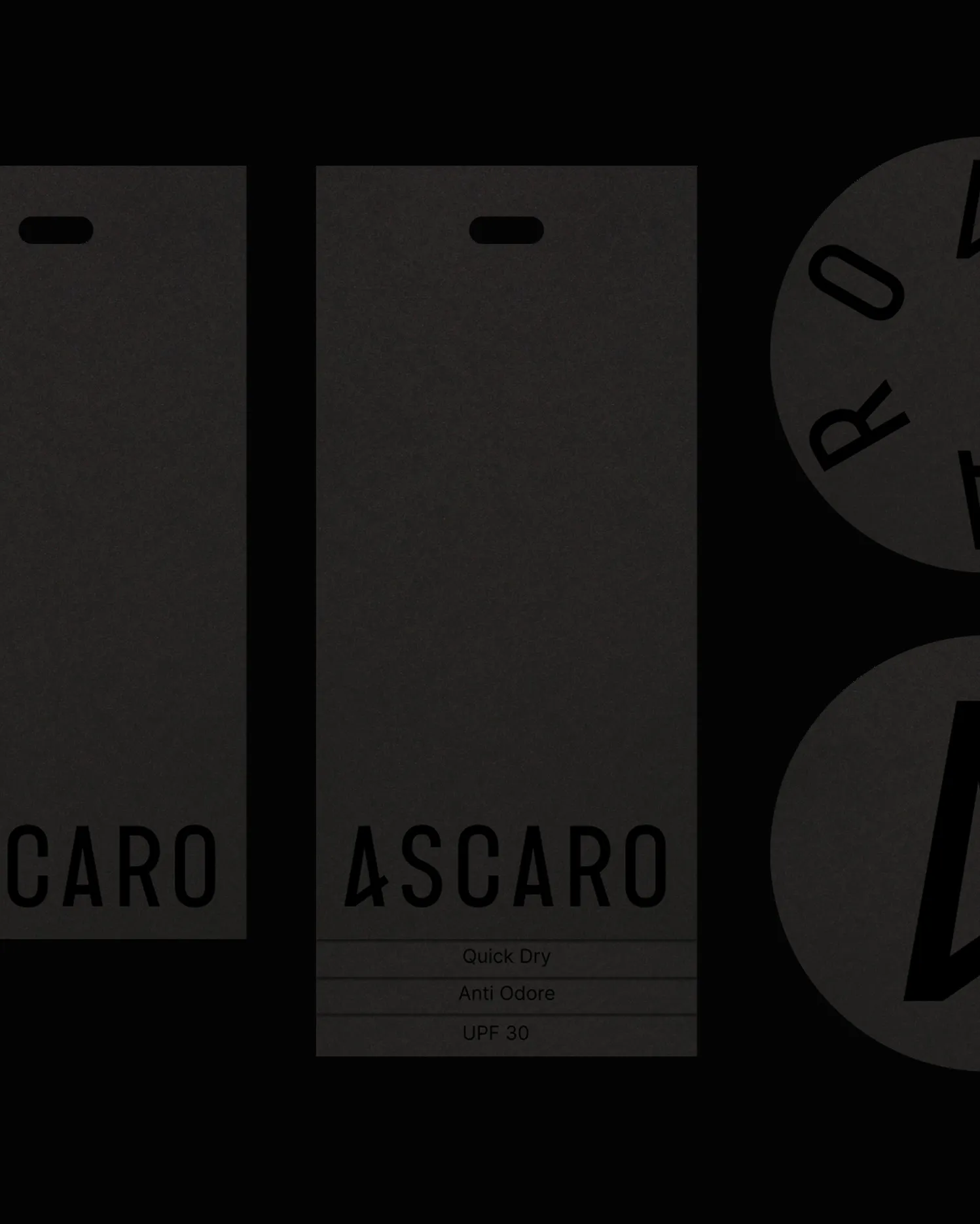
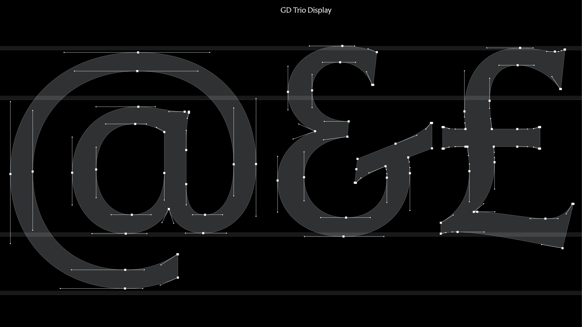
Drawn by us. Point by point.
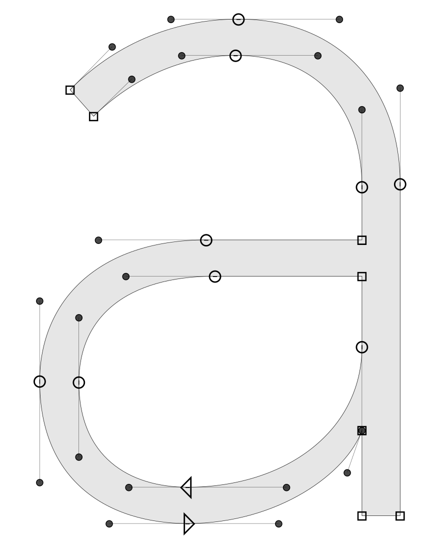
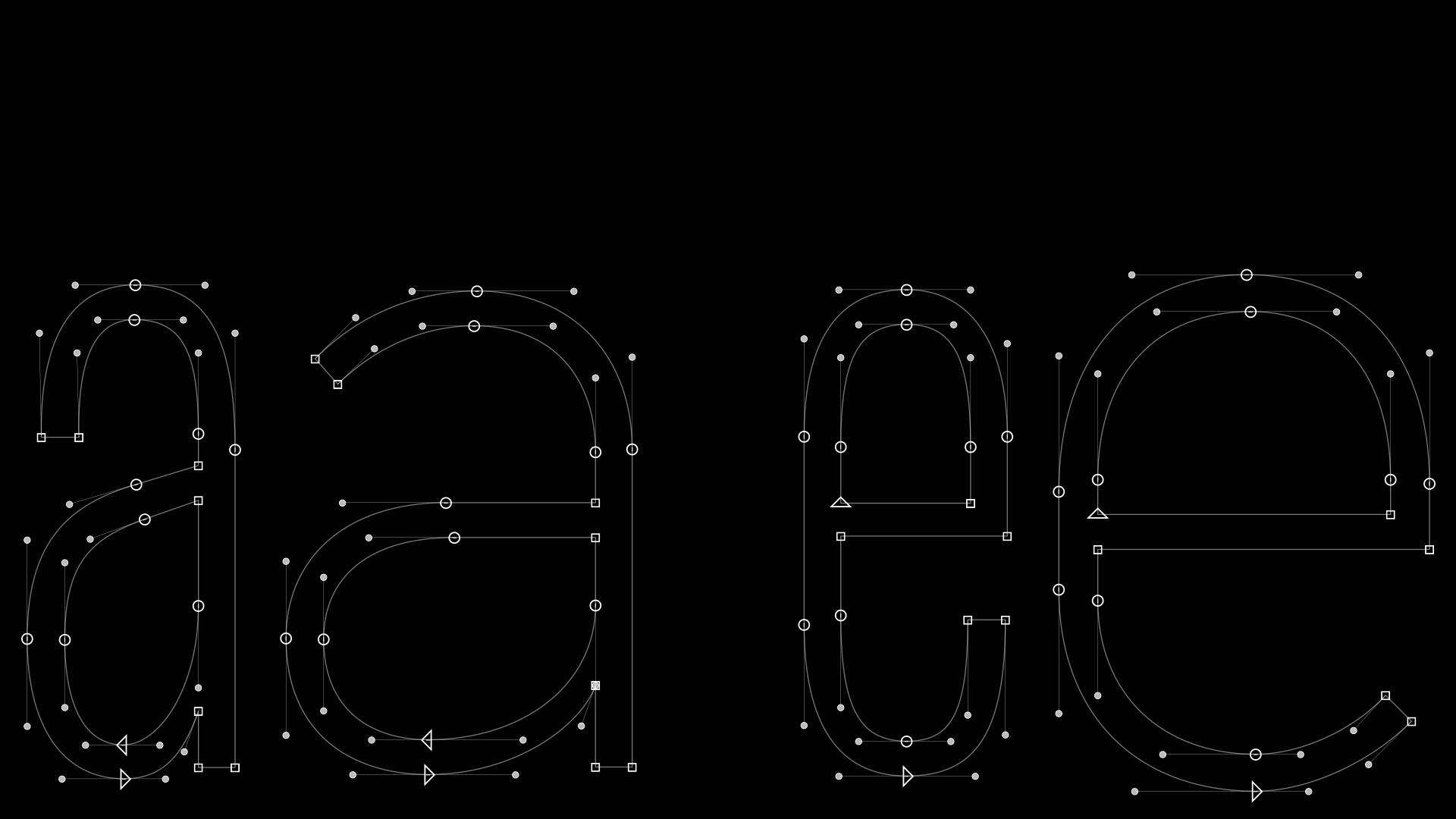
Every typeface is built from scratch by our team. Each outline point and Bézier control point is placed by hand, from the first letter to the last symbol. Historical references may inform a direction. Another foundry’s font files never form the starting point.
A bespoke project can be a completely new design or an extension of our own work. Either way, it begins in Gärde Design Foundry’s library, never in a third-party typeface.
Two ways to commission
Exclusive (1a). We design and develop the typeface for you, and you pay for all of the development. You get exclusive rights, the name and the control, and you protect it. We never sell or use it.
Shared (1b). We draw the typeface to your brief, and you pay half of the development cost. You use it under your own name, with no headcount limit, and can share it with the agencies and suppliers who work for you. It is not exclusive: we keep the design and may later sell it under another name, after an agreed period and without the elements specific to your brand.
Both are signed agreements with G Design AB, quoted for each project. Compare all four licenses.
Your name, your call
A bespoke typeface is drawn entirely for your brand, so its name is too. Bespoke names do not include the GD prefix. We develop a shortlist with you and run a basic check against existing typefaces. The final choice is yours, and so is clearing it for your market. Name, ownership and usage terms are agreed in the commission contract.
Not ready for bespoke? Start with a Brand License.
With the Agency Sharing add-on, a Brand License lets your external designers, freelancers, agencies and developers use the font files on their own computers for work on your brand, with no separate license needed. Access must be necessary for the assignment, never for another client or the supplier’s own branding.
Recipients must accept the restrictions in writing, keep the files secure and delete them when the assignment ends. Printers and prepress bureaus are already covered by every license. You add Agency Sharing, a Custom Font Name, or both at checkout, for any company size up to 2,000 people, with no separate agreement to sign.
More than 2,000 people, or global use and sharing at scale? An Enterprise License is a signed agreement for an existing GD typeface under its original name, with no headcount limit.
Renaming rights
Renaming rights can be added to a Brand License at checkout. The font then carries your brand name followed by the typeface name in its file properties and in your design tools, for example Yourbrand Trio, without the GD prefix. Want a name of your own that leaves out the typeface name? Contact us and we agree it separately. A bespoke commission uses the name agreed with you, without the GD prefix.
Renaming rights license the use of an alternate name. They do not transfer ownership. The original design, its structure and its IP remain with Gärde Design Foundry.
We made custom fonts for
Our retail fonts are used by
Let’s draw yours.
Tell us about your brand and where your typography needs to work. We’ll come back with a direction, a timeline and a price.